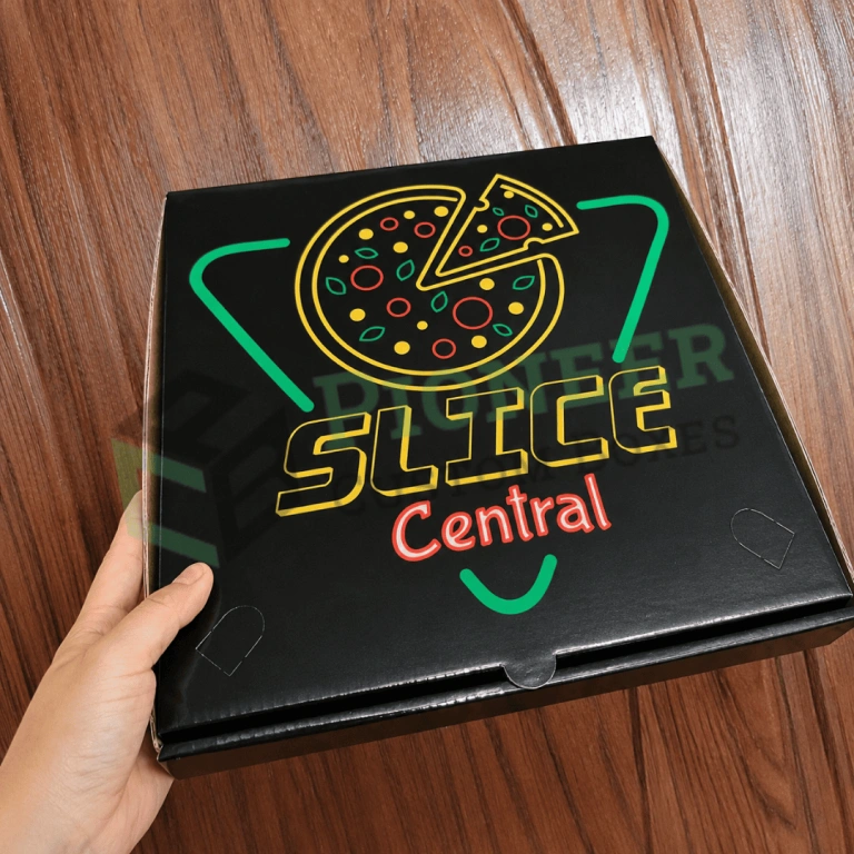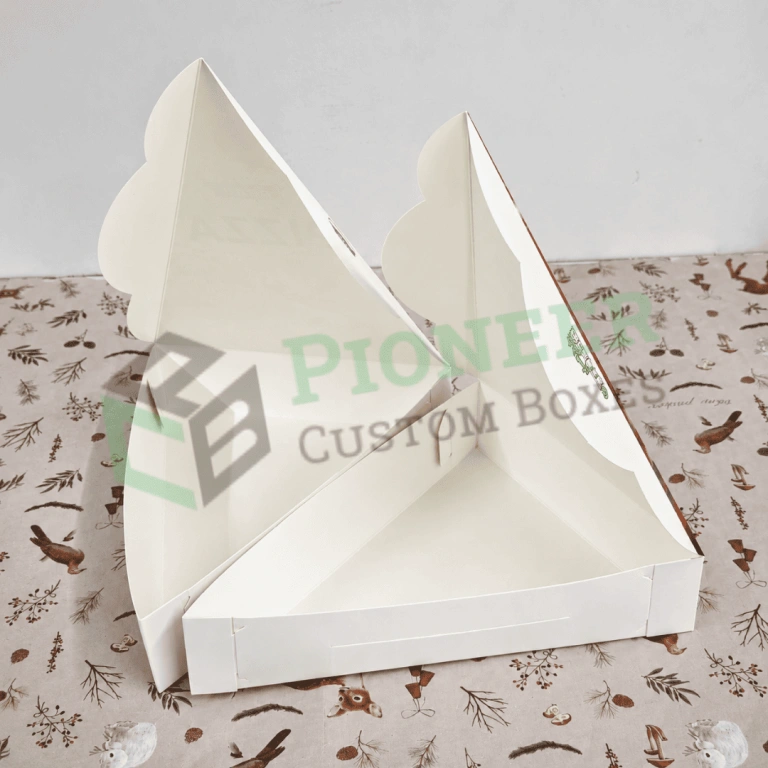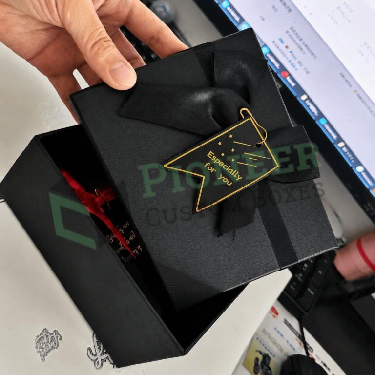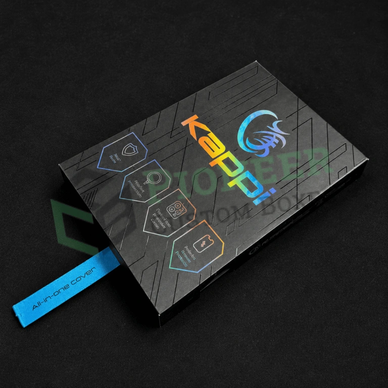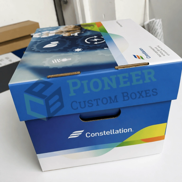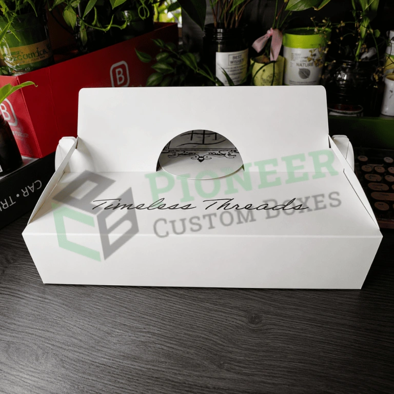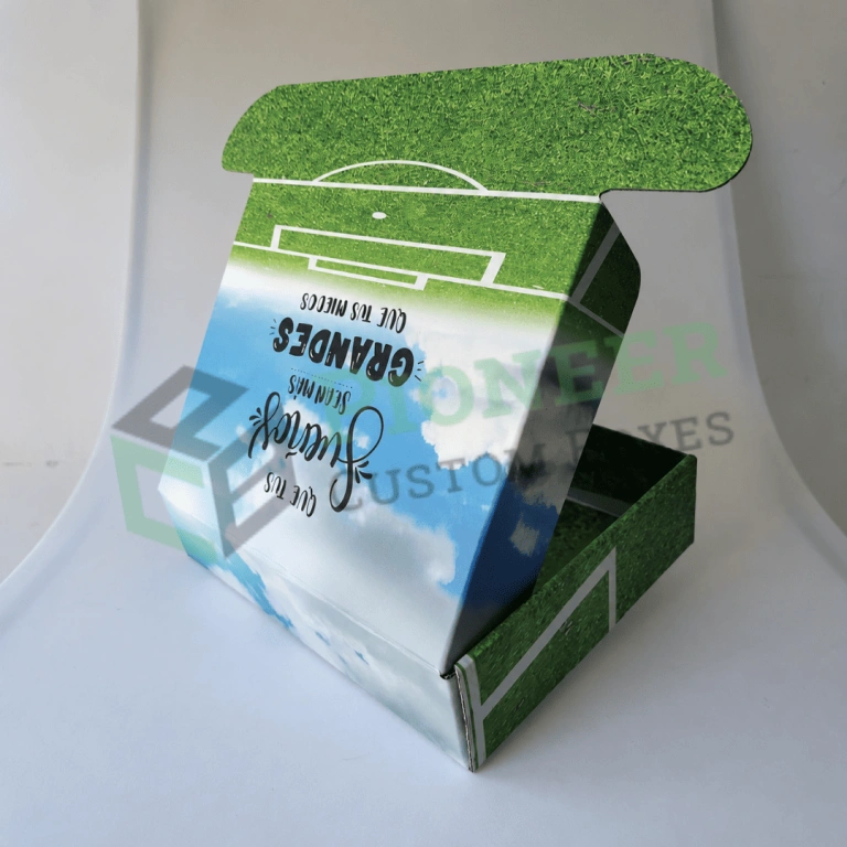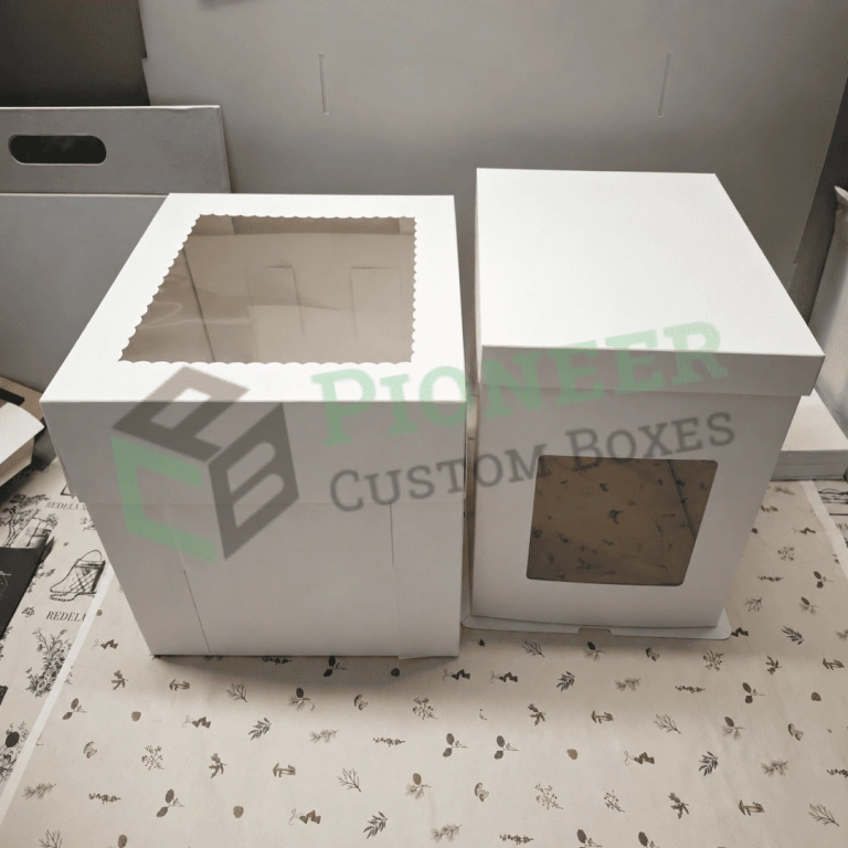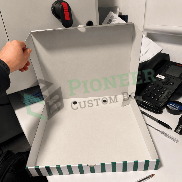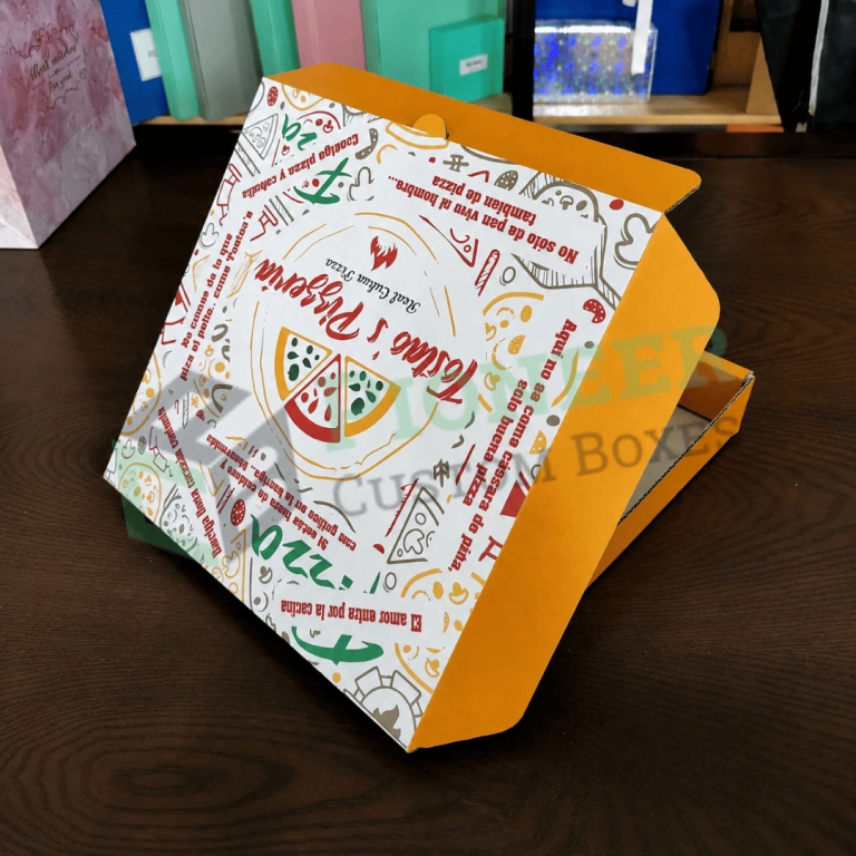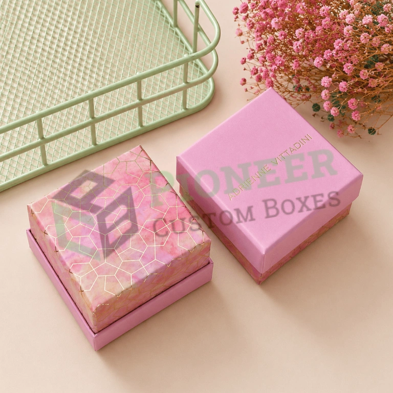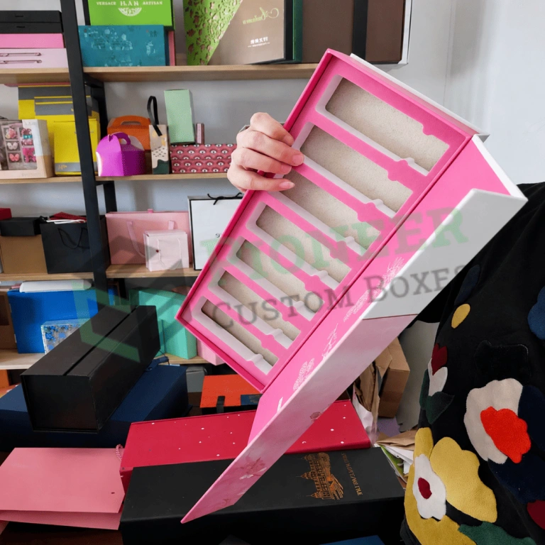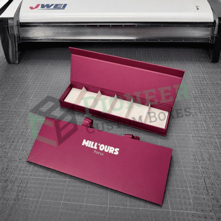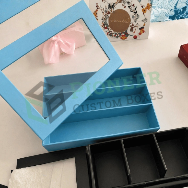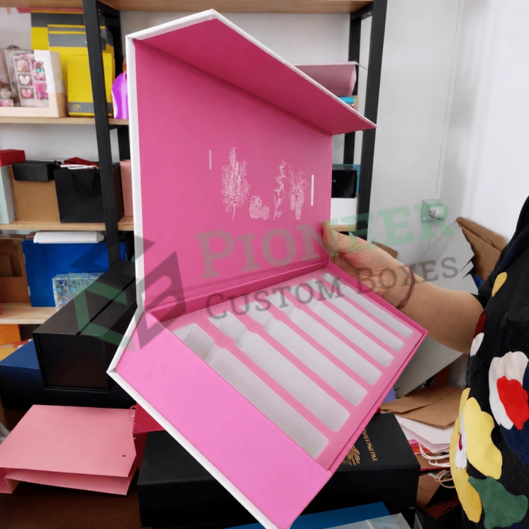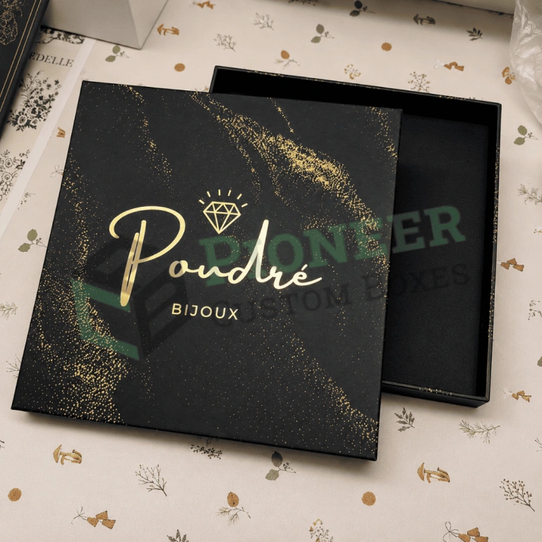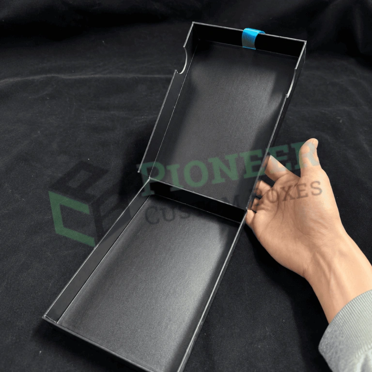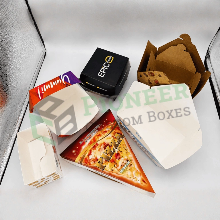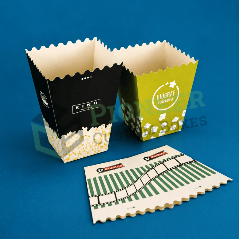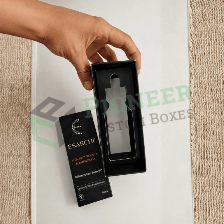
Custom straight tuck boxes from Pioneer Custom Boxes help cosmetic, skincare, supplement, candle, soap, food and ecommerce brands package products with a completely clean front panel. Choose SBS or kraft board from 14pt to 24pt, custom sizes, windows, inserts, foil, soft touch lamination, logo printing, free design support, no MOQ and free USA shipping.
Custom straight tuck boxes close with both end flaps folding in the same direction, hinging from the back panel toward the front. That one structural decision is why beauty, supplement and premium retail brands specify this style so consistently. Every tuck slit, fold line and glue joint ends up at the rear of the carton, so the front panel stays completely uninterrupted for your artwork.
On a shelf that matters more than it sounds. A shopper sees the front face first, and a hinge line running across a product photograph or a block of brand color reads as a flaw even when nobody can name it. A straight tuck removes that flaw by design rather than by careful artwork placement.
Pioneer Custom Boxes manufactures straight tuck end cartons in the United States. We cut our own dies, run our own presses and finish every order in house, which means your carton is built around your actual product rather than forced into a stock size. It also means you talk to the people who make it.
Every order starts at zero minimum order quantity. Dielines and design support cost nothing, shipping across the United States is free, and standard production runs eight to twelve business days with rush available in four to six.
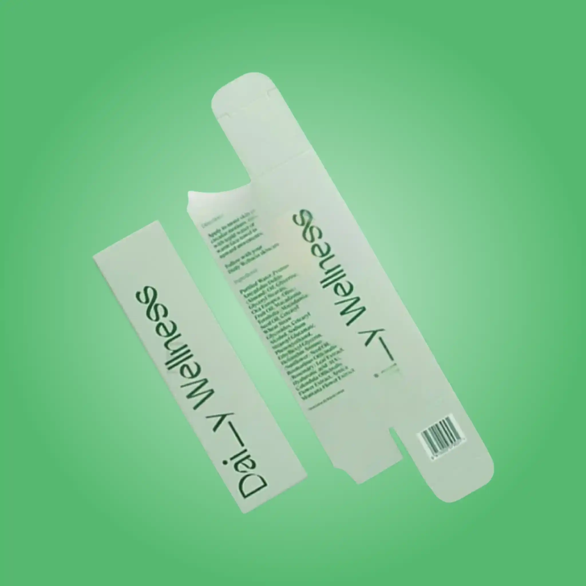
The carton begins as a single flat blank. Four main panels wrap around the product and glue to a narrow tab on one edge, forming the body. The top and bottom closures are then formed by flaps extending from those panels, and it is the direction of those flaps that defines the style.
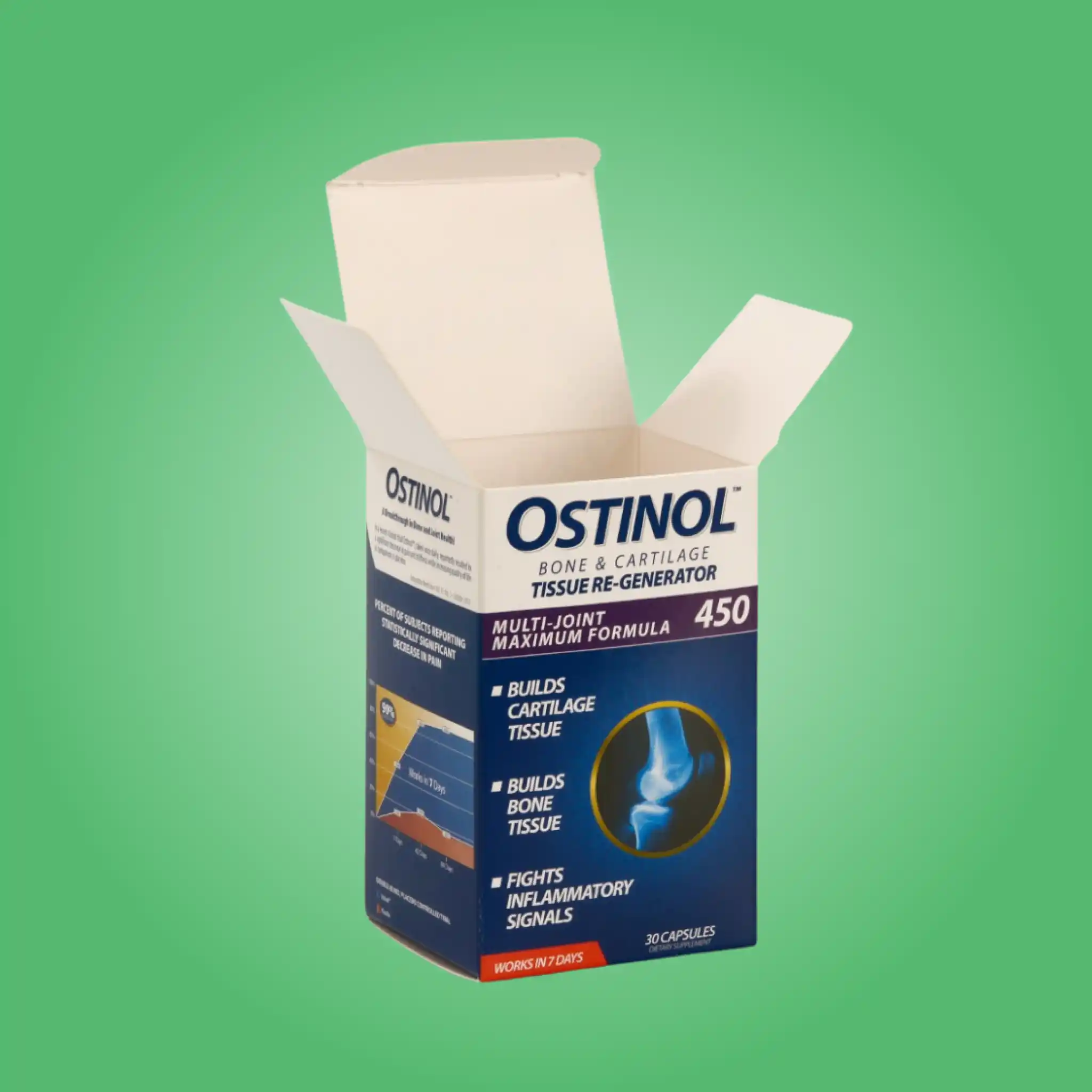
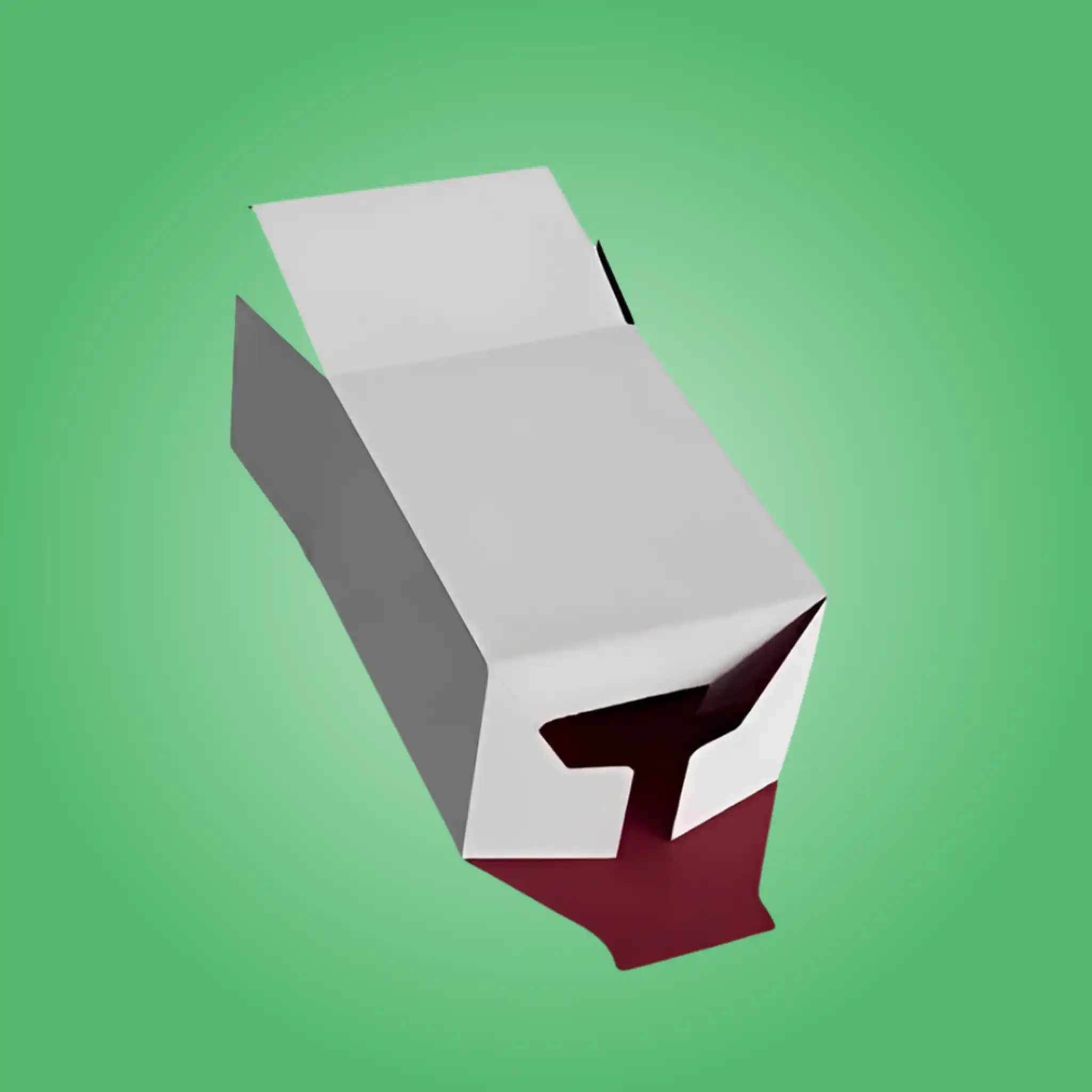
On a straight tuck, both the top and the bottom flap extend from the same panel, so both fold in the same direction when you close them. Each flap carries a tuck tab that slots into a slit on the opposite panel, and dust flaps on either side close first to seal the ends and add rigidity.
Because both tucks hinge from the rear, the front panel is a single uninterrupted sheet of board from top score to bottom score. Nothing crosses it. That is the entire commercial argument for the style, and for products sold on appearance it is a strong one.
The trade-off is board consumption. Both flaps extending from one panel means the blank is slightly larger than an equivalent reverse tuck, and it nests a little less efficiently on a press sheet. On a retail carton that difference is a fraction of a cent per unit, comfortably repaid by a cleaner face.
We also build in a locking variation where the tuck tabs are cut with small friction ears that grip the slit. That stops a carton popping open in a shipping case or a shopping bag, and it costs nothing extra on the die.
These two styles look almost identical flat and behave differently in every way that matters commercially. Getting the choice right is worth more than most finishing decisions.
A reverse tuck folds its flaps in opposite directions, so one hinges from the back and one from the front. That geometry nests tightly on a press sheet and uses less board, which is why it dominates high-volume commodity packaging. It also fills faster by hand, because the bottom flap folds away from the operator.
A straight tuck sacrifices both of those small efficiencies to protect the front face. For a serum bottle at a premium price point, an uninterrupted front panel is worth several times the board difference. For an inner carton nobody displays, it is not.
There is a second consideration that buyers often miss. On a straight tuck both tucks open in the same direction, so a customer opening the carton for the first time works with a predictable motion. Reverse tucks occasionally get opened from the wrong end, which matters when the product is oriented inside.
If your product sits between the two cases, order a physical sample of each. We produce both from your dimensions at no charge, and holding them settles the question in under a minute.
Every die we cut is sized to your measured product, so nothing here is a fixed catalog. These are the formats we produce most frequently, and they are useful reference points when you are estimating before measuring.
| Application | Typical Size (inches) | Caliper | Structural Note |
|---|---|---|---|
| Serum and dropper bottle | 1.5 x 1.5 x 4 | 16pt SBS | Recessed insert for glass |
| Cream and moisturizer jar | 3 x 3 x 3 | 18pt SBS | Square face carries artwork well |
| Supplement bottle | 2.5 x 2.5 x 5 | 18pt SBS | Panel space for required text |
| Skincare tube | 1.75 x 1.5 x 6 | 16pt SBS | Tall narrow proportion |
| Soap bar | 3.5 x 2.5 x 1.25 | 16pt kraft or SBS | Window optional |
| Lipstick and slim cosmetics | 1 x 1 x 3.5 | 14pt to 16pt | Foil accent suits this format |
| Candle in glass | 3.5 x 3.5 x 4 | 18pt to 20pt | Heavier caliper for weight |
| Electronics accessory | 6 x 4 x 1.5 | 18pt SBS | Paperboard tray inside |
| Tea and dry goods | 4 x 3 x 5 | 18pt with liner | Barrier liner for aroma |
| Small gift set | 8 x 5 x 2 | 18pt with insert | Multi-cavity divider |
| Travel and sample size | 1.25 x 1.25 x 2.5 | 14pt | Lowest cost per unit |
Send your product dimensions and quantity and we return a free dieline sized precisely to them within one business day. If you have the product but no measurements, photograph it beside a ruler and we will work the sizing out with you.
Sizing is where most straight tuck cartons succeed or fail, and it is entirely decided before anything is printed.
Every dimension we quote is internal, measured to the inside faces of the assembled carton. Board has thickness, so an 18pt carton finishes roughly a millimeter larger externally on each axis. Brands that send external dimensions end up with a carton their product does not fit, which is the single most common sizing error we correct.
Clearance needs to be deliberate rather than generous. Around a rigid product such as a glass bottle, one to two millimeters on each side lets the product drop in cleanly without rattling. Any more and the product shifts in transit, which scuffs printed panels from the inside and lets the carton collapse under stacking pressure.
Height deserves separate attention because it decides whether the tuck closes comfortably. A carton cut exactly to product height forces the operator to press the flap down against the product, which cracks the score over repeated filling. We add a small controlled headroom so the closure works without strain.
For soft or variable products, we measure the largest realistic unit rather than a nominal one. Hand-poured candles, artisan soaps and filled pouches all vary batch to batch, and a carton cut to the average traps a third of your production.
Send us the product itself where you can. Measuring it here removes every assumption, and it costs you nothing but the postage.
Board choice controls how the carton prints, how it folds and whether it survives a stockroom. We run every option below on the same die, so you can compare without new tooling.
Solid bleached sulfate is the default for printed retail cartons. Its bright white clay-coated surface reproduces photography and brand colors accurately, scores cleanly without cracking, and accepts lamination, foil and spot UV without difficulty. We run 14pt for very light items such as sachets, 16pt to 18pt across most cosmetic and supplement work, and 20pt to 24pt where a heavy glass jar or a candle demands real rigidity.
Kraft gives a natural brown surface that signals organic, artisan and refill positioning without a single word of copy. It costs less than bleached board. Inks print warmer on kraft and white ink will not read as white, so kraft designs generally use one or two bold colors and let the substrate carry the rest of the character. A single foil mark on bare kraft is one of the most cost-effective premium looks available.
E-flute steps in when a straight tuck carton must survive a parcel network alone rather than traveling inside an outer case. The fluted layer adds genuine crush resistance while still printing well, and it suits heavier products or direct-to-consumer orders shipping without a shipper.
Both SBS and kraft are available with post-consumer recycled content and with FSC certification. We document exactly what your board contains, so any sustainability claim you publish is accurate rather than assumed. Buyers increasingly ask for that documentation, and having it ready turns a difficult question into a short answer.
Caliper should follow the loaded weight and the real stack height rather than habit. A carton chosen on print quality alone bows around a glass jar during filling, the operator forces it, and the score cracks. Tell us the product weight and how your cases stack, and we specify board with margin rather than at the limit.
| Material | Typical Caliper | Strengths | Best For | Relative Cost |
|---|---|---|---|---|
| SBS paperboard | 14pt to 24pt | Bright white face, sharp print | Retail cartons judged on shelf | Moderate |
| Kraft paperboard | 16pt to 24pt | Natural look, hides marking | Organic and artisan positioning | Lower |
| E-flute corrugated | 32 ECT typical | Impact and crush resistance | Heavier products and parcel shipping | Higher |
| Recycled and FSC-certified stocks | Any grade above | Documented sourcing and content | Brands audited on sustainability | Small premium |
Print method decides both how the carton looks and what it costs, so we quote each option separately rather than bundling them into one figure.
Offset transfers ink from metal plates through a rubber blanket onto the sheet. It holds the finest detail, the smoothest gradients and the most consistent color across a long run, which matters when twenty of your cartons sit together on a shelf and any drift between them is visible. Plate setup carries a one-time cost per design, so offset becomes the economical choice once quantities pass roughly one thousand pieces, and unit price keeps falling from there.
For straight tuck cartons specifically, offset is worth the setup whenever the front face carries photography or a large area of a precise brand color. Those are exactly the cases where the clean front panel was the reason you chose the style.
Digital prints straight from your artwork file with no plates involved, so setup cost disappears entirely. A run of two hundred cartons becomes as practical as a run of two thousand, which is what makes zero minimum order quantity a real offer rather than a slogan. Digital also supports variable data, so each carton in a single run can carry a different scent, strength or batch code.
Color reproduction on digital is excellent today. Very large flat areas of a single color still lay down marginally more evenly on offset, so for a carton that is mostly one solid brand color at volume we will usually recommend plates.
Flexo prints from flexible plates and suits corrugated stock rather than fine folding board. Your retail straight tuck will not normally run flexo, but the shipping case that carries it usually will, since large simple graphics reproduce economically on a fluted surface.
Color is where packaging projects most often disappoint, and almost always because the systems were mixed up rather than because anything went wrong on press.
CMYK builds every color from cyan, magenta, yellow and black separations. It reproduces photography, product imagery and soft gradients convincingly, and it costs the least because four inks cover the whole design regardless of how complex it is. Certain vivid, pastel and metallic shades sit outside its achievable range, which is why brands with a distinctive house color usually pair CMYK artwork with a single spot ink.
The Pantone Matching System uses pre-mixed inks, so a specified shade prints identically on every run and across different board types. If customers recognize your brand by a particular color, that color belongs in PMS rather than CMYK without exception. Each spot ink occupies its own press unit, so the count affects cost directly. We store your Pantone references permanently and match against a physical draw-down before every press run, which is what keeps your fifth reorder matching your first.
RGB is a screen color space and cannot be printed directly. Your website, marketplace listings, renders and social assets all live in RGB, and those values require conversion before production. Saturated screen colors frequently shift during that conversion, most noticeably in bright blues and greens. We run the conversion ourselves and show you the printed outcome before the full run, so your carton matches the expectation your online presence created. Supply artwork in CMYK or with Pantone references wherever you can.
Because a straight tuck presents an uninterrupted front face, finishing reads more clearly on this style than on almost any other carton. Each option runs as a separate pass through the plant, so we price them individually and you keep only what earns its cost.
Matte film gives a soft, restrained surface that reads as considered rather than loud. It is the most common base finish on premium straight tuck cartons because it makes foil and spot UV stand out sharply by contrast. Matte scuffs more visibly than gloss on very dark colors, so we sometimes add a scuff-resistant coating underneath for deep navy or black panels.
Gloss film raises color saturation and makes photography look vivid under retail lighting. It also resists moisture and scuffing well, which suits cartons that travel and get handled repeatedly. Gloss shows fingerprints, so it performs better on busy artwork than on large flat dark areas.
Soft touch produces a velvet surface that feels considerably more expensive than it costs. On a clean straight tuck face it is particularly effective, because there is no interruption to break the tactile impression. It also resists fingerprints, which matters for cartons handled repeatedly in store.
Hot foil presses metallic film into the board under heat and pressure. A single foil hit on the logo costs a fraction of full-panel coverage and customers read the two almost identically. Foil sits best against matte lamination or bare kraft, where the contrast makes it shine rather than compete.
Spot UV applies high-gloss varnish to selected areas only. Against a matte background the contrast is striking and it draws the eye exactly where you want it, which on a clean front panel is easy to control. Keep spot UV away from the barcode, because gloss causes scanning failures at checkout.
Embossing raises an area of board while debossing presses it in. Both create texture that customers register through touch before conscious thought. Combining a deboss with foil produces the crisp jeweled effect common on premium skincare, and it works especially well centered on an otherwise empty face.
Restraint usually outperforms accumulation here. A straight tuck already gives you a clean canvas, so one strong finish on a considered design almost always looks more expensive than three competing treatments.
Structural extras change how the carton performs in a store, in a warehouse and in a customer hand. Each is quoted as its own line so you can see what it costs.
| Add-On | What It Does | Best Suited To |
|---|---|---|
| Die-cut window | Shows the product without opening the carton | Soap, candles, gift sets |
| PET window film | Keeps dust off while product stays visible | Retail shelf products |
| Paperboard insert | Holds the product centered and still | Glass bottles and jars |
| Multi-cavity divider | Separates several items in one carton | Sample and gift sets |
| Hang tab | Allows peg display | Small accessories |
| Tear strip | Opens cleanly without tools | Subscription and sealed goods |
| Friction lock tucks | Stops the carton popping open | Cartons shipped loose |
| Printed interior | Extends the unboxing moment | Direct-to-consumer brands |
| Tamper-evident seal | Shows if the carton was opened | Wellness and ingestibles |
On a straight tuck, a window is best placed on the front panel, since that face has no hinge to interrupt the aperture. We cut shaped windows at no extra tooling cost when the shape is part of your branding.
Two quotes for what looks like the same carton can differ by half, and the reason is nearly always a specification detail rather than a supplier margin. Every variable below sits within your control.
Carton dimensions lead, because board is priced by area. Removing a quarter inch of unnecessary clearance from each dimension cuts material on every unit you will ever order, and it usually improves how the product sits inside as well. We measure your product rather than working from a rounded figure, and that step alone often saves several percent.
Caliper follows. Moving from 16pt to 24pt raises material cost noticeably and makes the carton feel substantially more solid. The heavier board belongs where weight or stacking genuinely demands it, and a lightweight cosmetic carton gains nothing from 24pt.
Finishing sits third and is where budgets disappear fastest. Each lamination, foil or spot UV pass adds a step through the plant. Spot color count comes next, since every Pantone ink occupies its own press unit. Quantity finishes the list, because plate and setup costs spread across the run, and digital printing removes them entirely on short runs.
The largest single saving available to most brands is running several products through one die and changing only the printed panel. The tooling exists, the fit is proven, and every variant benefits from the same setup.
Folding cartons show defects clearly, and retailers reject them for faults a shipping box would survive. Every order passes a documented check before it leaves our floor.
| Check | What We Verify | Why It Matters |
|---|---|---|
| Dimensional accuracy | Internal fit against the approved dieline | A tight carton buckles during filling |
| Tuck flap fit | Tab seats fully without forcing | A loose tuck opens on a shelf |
| Score and crease quality | Clean folds with no cracking | Cracked creases expose white board edges |
| Glue bond strength | Rear seam pull test | A failed seam opens in transit |
| Front panel cleanliness | No marking or scuffing on the face | The clean face is why you chose this style |
| Print registration | Artwork aligned to cut and fold lines | Misregistration is visible at eye level |
| Color match | Pantone against a physical draw-down | Brand color must hold across reorders |
| Lamination adhesion | Edge lift and corner bond | Peeling film reaches the customer looking cheap |
| Foil adhesion | Tape test on stamped areas | Lifting foil ruins premium positioning |
| Barcode readability | Scan test on a flat matte area | Retailers reject unscannable cartons |
If anything fails, we remake it rather than ship it.
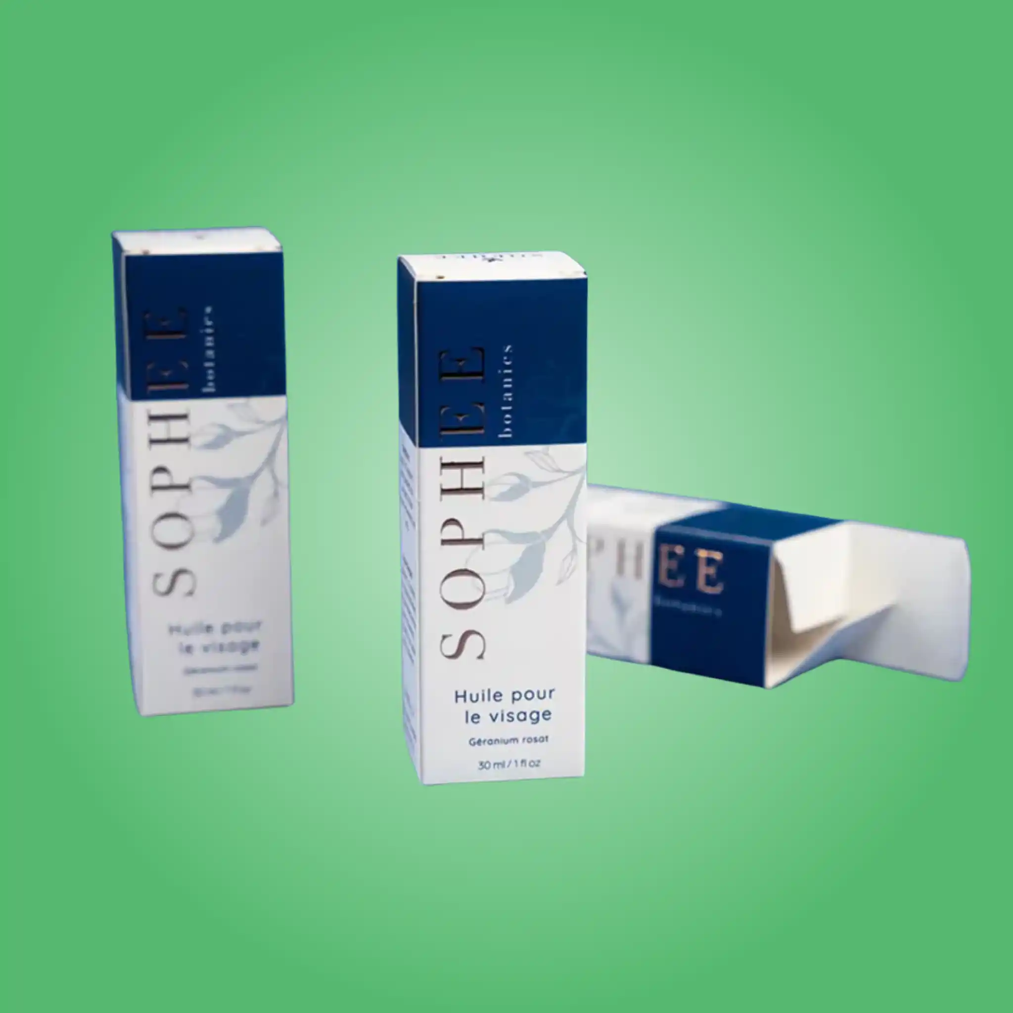
Cosmetics and skincare brands specify straight tuck cartons more than any other structure. The clean front face carries a product photograph or a minimal wordmark without a fold line crossing it, and the format handles bottles, jars, tubes and compacts equally well once the right insert is fitted. Soft touch lamination with a single foil mark is close to a default specification in this sector.
Supplement and wellness companies choose the style for the same visual reason plus a practical one. Required panel content takes real space, and a straight tuck gives three uninterrupted faces to lay supplement facts, directions and warnings out legibly rather than crowding them around a hinge.
Candle and home fragrance makers use them because the format photographs beautifully and needs no expensive finishing to look finished. A kraft straight tuck with one foil hit competes visually with packaging costing several times as much, and the heavier calipers handle a filled glass vessel safely.
Soap and bath brands pair them with a die-cut window on the front panel. Because that face has no hinge, the aperture can sit anywhere without interrupting a fold, which is not true of a reverse tuck.
Electronics and accessory brands use them with a paperboard tray, which holds a cable, a device or a small tool in position and turns a plain carton into a considered presentation. Food and confectionery brands use them wherever a barrier liner handles the direct product contact.
Cannabis and CBD brands increasingly use straight tucks for the panel space rather than the appearance, since required text and scannable codes both need uninterrupted flat areas that a front hinge would compromise.
A carton that looks right and fills badly costs you money every single day, so we test assembly before you commit to a run.
Straight tuck cartons suit hand filling well. The carton stands square on a bench, both flaps open away from the product, and the item drops in without fighting a front hinge. Across a few hundred units per shift that handling difference becomes real time.
For automated lines the priorities change entirely. Cartoning equipment needs consistent board stiffness, glue tabs positioned within a narrow tolerance and dimensions held tightly across the whole run. Board that varies slightly jams a feeder, and a line stoppage costs more per hour than the entire packaging order. Send us your equipment details and we build the dieline to those specifications rather than to a generic template.
Headroom deserves a decision rather than a default. Excess clearance lets the product shift and the carton collapse under stacking pressure, while too little slows filling and cracks scores as staff force the flap down. We test clearance against your actual product and recommend the smallest gap that still closes comfortably.
We also build and fold a physical sample from every new die before production. Timing that assembly by hand tells us things a drawing cannot, and it has saved clients from slow structures more than once.
Paperboard absorbs and releases moisture with the surrounding air, and that property causes most carton problems that appear after delivery rather than before it.
Cartons stored in a damp room soften and lose stiffness, so they bow during filling. Cartons stored somewhere very dry become brittle, and creases crack when folded. A stable indoor environment between roughly forty and sixty percent relative humidity keeps board behaving predictably, and it is the single most useful thing most brands can do to protect what they already bought.
Keep pallets off bare concrete, since concrete wicks moisture upward into the bottom cases. Leave shrink wrap intact until you need the stock, store flat cartons lying down rather than on edge, and rotate older cases forward so nothing sits for years absorbing whatever the room offers.
None of this needs special equipment. It needs a dry indoor space and a little rotation discipline.
The same errors recur across this style, and each one is avoidable before a die is cut.
Sending external dimensions instead of internal leads the list. Board has thickness, so a carton quoted externally finishes smaller inside than the buyer expected and the product no longer fits. Always specify internal.
Placing artwork across the rear glue seam is second. Every glued carton has a manufacturer joint, alignment across it is never perfect, and a logo positioned there looks slightly wrong on every unit. On a straight tuck this is easy to avoid, since the whole front face is available.
Under-specifying caliper is third, and it surfaces during filling rather than at delivery. A carton that feels adequate empty bows around a loaded glass jar, the operator forces it, and the score cracks. Specify against the loaded weight and the stack height.
Running a barcode over gloss lamination or a foil area causes scan failures at checkout, and retailers escalate that faster than almost any other complaint. Codes belong on a flat matte area with adequate quiet zone and strong contrast.
Finally, approving artwork without a physical sample. A fold running through a product photograph, a finish that hides required text, or a tuck that is stiffer than expected are all obvious in the hand and invisible on a screen. Samples take three to five business days and cost far less than a reprint.
A skincare brand came to us three weeks before a launch with cartons that were cracking along the top score during filling. Roughly one in fifteen was being discarded, and their contract filler had paused the run.
Two things were wrong and neither was the printer they blamed. The carton was specified at 14pt for a 50ml glass jar, too light for the weight, and the internal height had been cut with almost no headroom, so staff were pressing the flap down onto the jar lid.
We moved the board to 18pt SBS, added two millimeters of headroom and three millimeters of width clearance, and kept their artwork completely unchanged. We also switched the tuck to a friction-lock cut so cartons stopped springing open in the shipping case.
Scrap dropped below one percent on the next run. Material cost rose about three cents per carton, and the waste they stopped producing covered that several times over in the first week. Their launch shipped on schedule.
Ordering runs through four steps and our team carries the technical work in each one. You never need packaging expertise to receive a correct carton.
First, send your product dimensions and quantity. If you have the product but no measurements, describe it or send photographs beside a ruler and we work the sizing out with you. Tell us how the carton reaches the customer as well, since a retail shelf and a parcel network demand different specifications.
Second, we return a free dieline and a written quote within one business day. The dieline maps every panel, crease, tuck slit, glue tab and bleed area on a single flat sheet, so your designer places artwork with certainty rather than guessing where a fold lands. That file stays yours permanently.
Third, you approve a digital proof showing artwork in position on the assembled structure. Request a physical sample whenever a finish or a structure is new to you. Samples take three to five business days and prevent far more expensive surprises.
Fourth, we produce and ship. Standard production runs eight to twelve business days, rush production runs four to six, and shipping across the United States costs nothing. Reorders skip straight to production, because we keep your dieline, board specification, Pantone references and print files on record permanently.
Three things make custom straight tuck boxes practical for a business of any size, and none of them carry a hidden charge.
Zero minimum order quantity means you order what you actually need. A new brand can prove a concept with fifty cartons and an established one can order fifty thousand, on identical terms through the same process. Digital printing covers the short runs so there is no plate cost to absorb.
Free design support covers structural work and artwork preparation. Our team builds the dieline, positions your logo, checks that required panels stay legible and prepares print-ready files. If you already work with a designer, we supply a layered template marked with fold lines, bleed and safety margins so nothing is left to interpretation.
Free shipping applies across the United States on every order, rush production included. We manufacture domestically, so lead times stay short and nothing waits at a port before your launch date.
We are a direct manufacturer rather than a broker. We cut our own dies, run our own presses and finish every order in house, which is why we can quote quickly, adjust a specification mid-conversation and stand behind what leaves our floor.
That control also shortens the correction cycle. When a first sample needs a dimensional change, we make it in days instead of sending it through a chain of intermediaries and waiting weeks for a revision.
Send us your product dimensions and your quantity, and we will return a free dieline and a written quote for custom straight tuck boxes within one business day. Order now, or get a free quote and we will help you specify the right carton the first time.
| Box Style | Custom Straight Tuck Boxes |
| Dimension (L + W + H) | All Custom Sizes & Shapes |
| Quantities | No Minimum Order Required |
| Paper Stock | 10pt to 28pt (60lb to 400lb) Eco-Friendly Kraft, E-flute Corrugated, Bux Board, Cardstock |
| Printing | No Printing, CMYK, CMYK + 1 PMS color, CMYK + 2 PMS colors |
| Finishing | Gloss Lamination, Matte Lamination, Gloss AQ, Gloss UV, Matte UV, Spot UV, Embossing, Foiling |
| Included Options | Die Cutting, Gluing, Scored, Perforation |
| Additional Options | Eco-Friendly, Recycled Boxes, Biodegradable |
| Proof | Flat View, 3D Mock-up, Physical Sampling (On request) |
| Turnaround | 4 – 8 Business Days, RUSH |
| Shipping | FLAT |
Every great product deserves packaging that turns heads. Here's how we make it happen — step by seamless step.
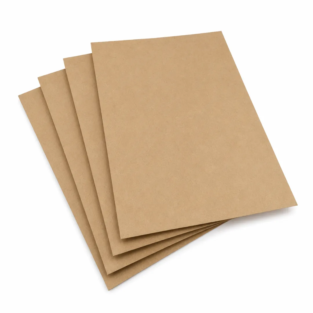
Kraft paper is a strong, durable and reliable material that is widely used across many different industries.
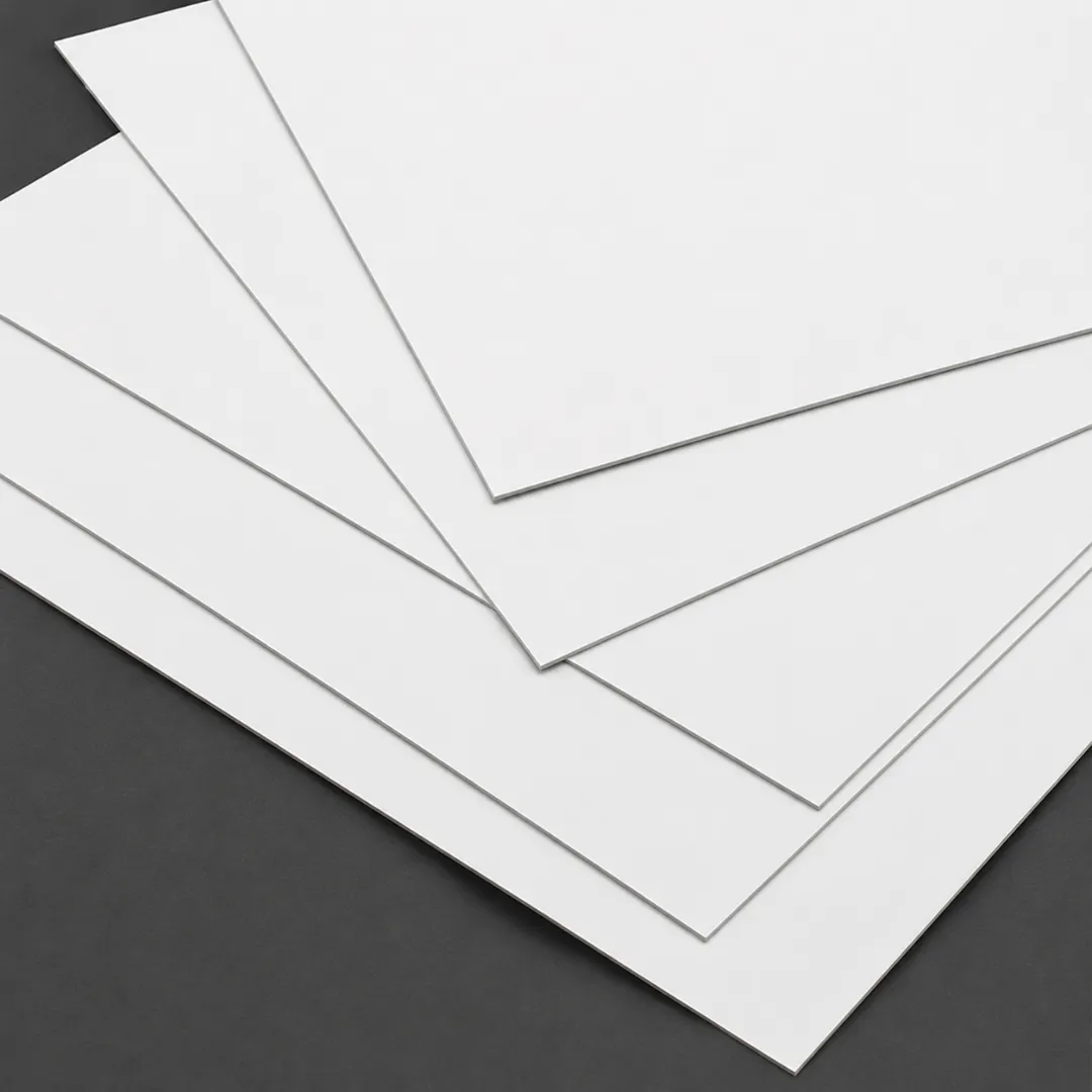
We use cardboard material with the least environmental impact and minimizes waste generation.
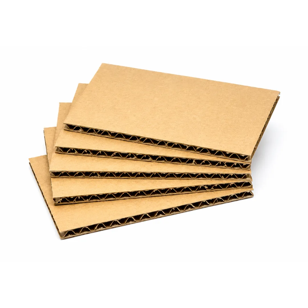
Corrugated material is easy to customize, cost effective and sustainable. It is also great for branding purposes.
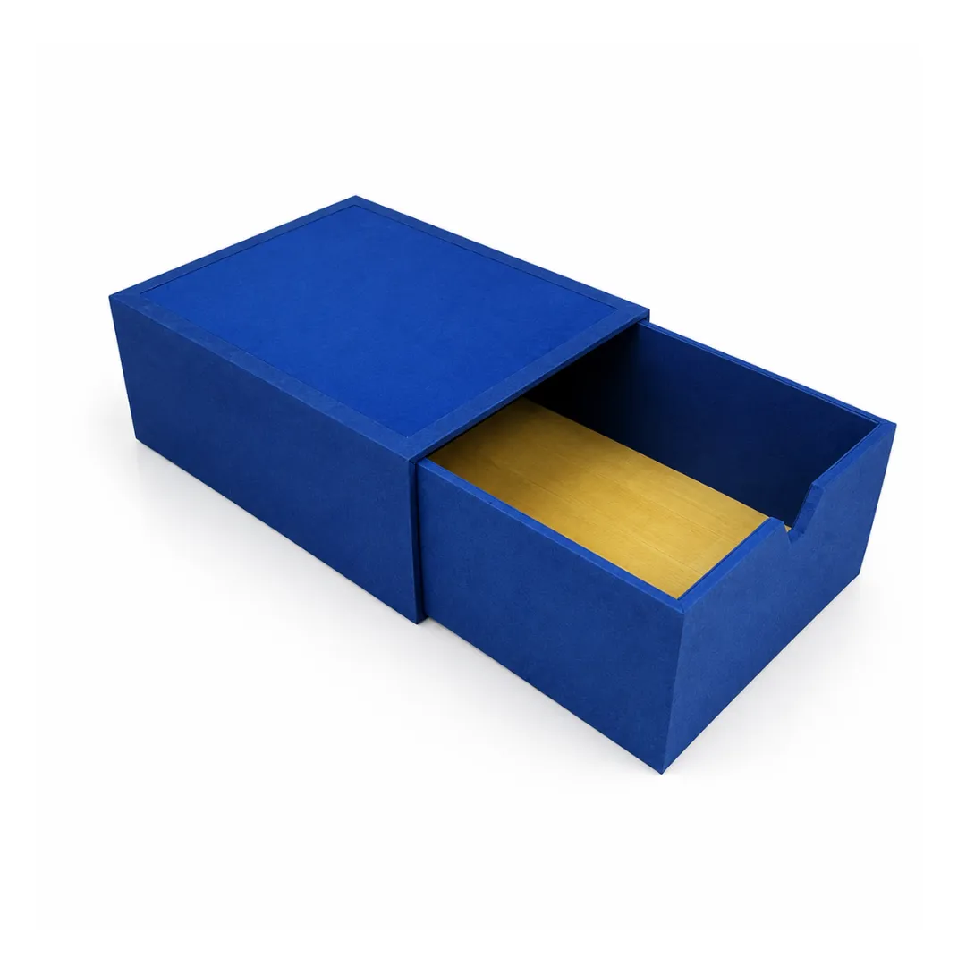
Rigid is highly protective, affordable and recyclable material. These boxes provide maximum protection.
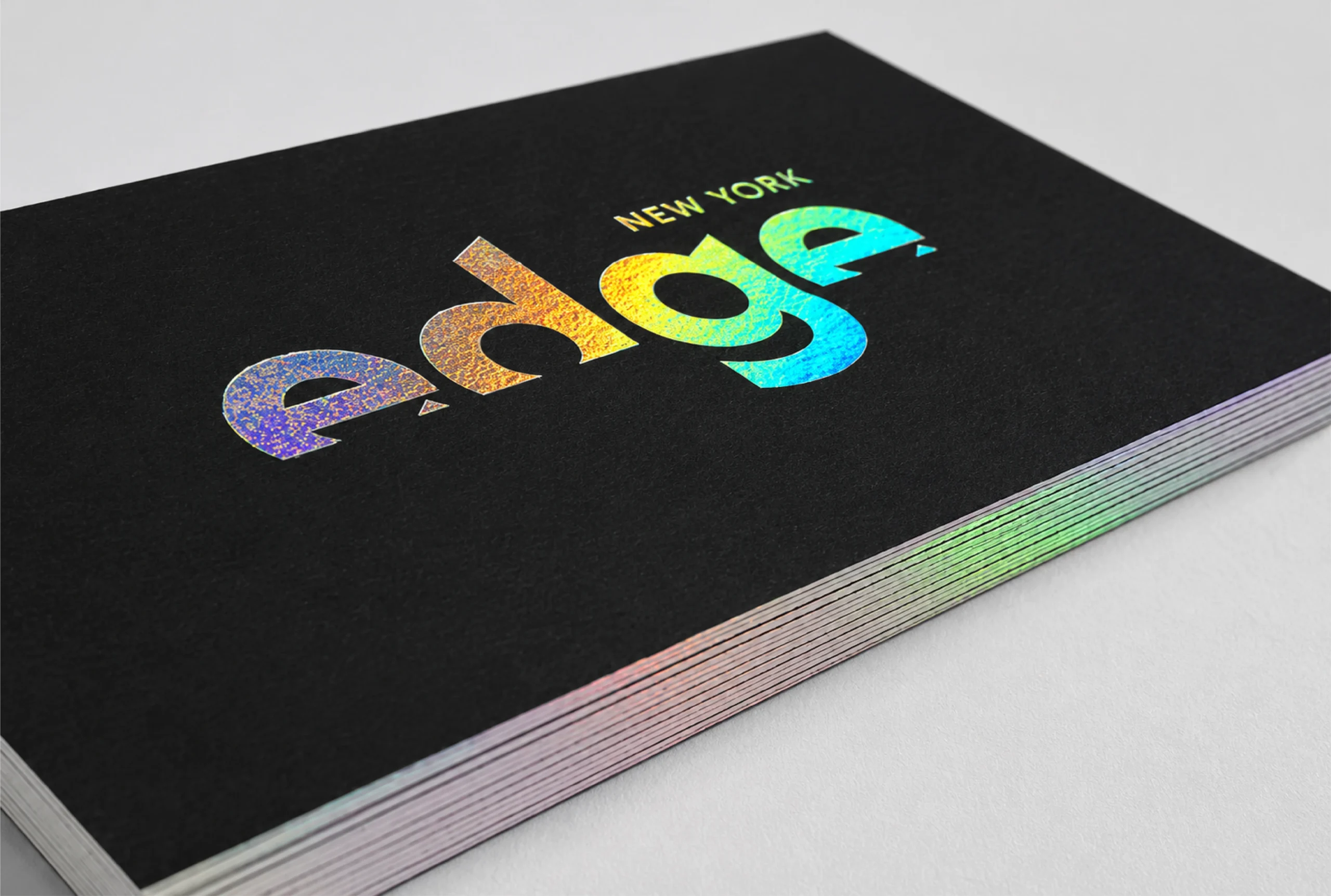
Holographic foil diffracts light and reveals the colors of the rainbow at various angles.
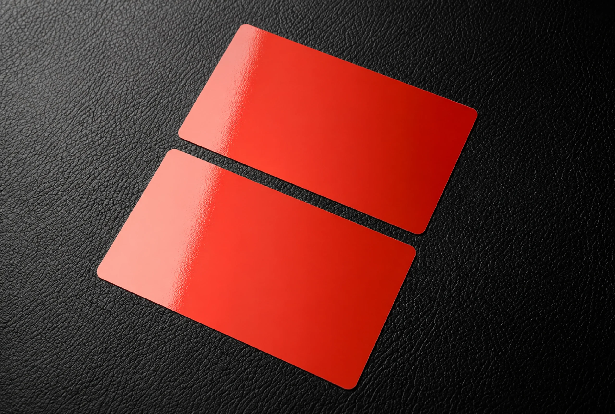
Our glossy finishing gives your packaging an extra layer of shine.
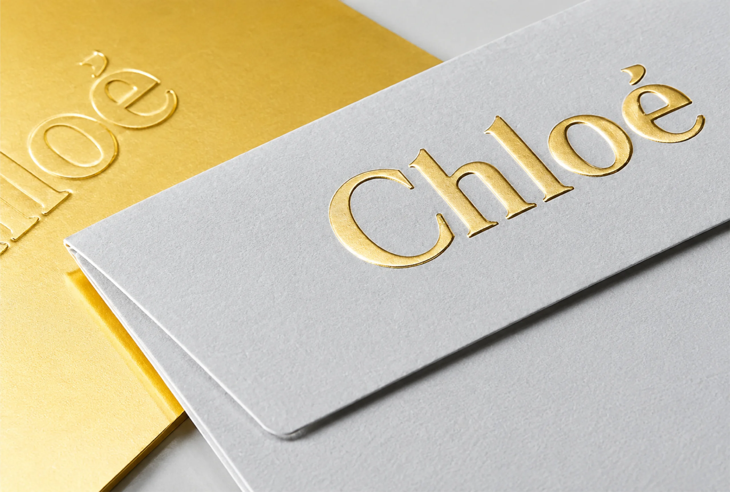
Decorate a wide range of your product packaging with our foil stamping.

With our embossing technique, we transfer the finest details of your product on packaging.
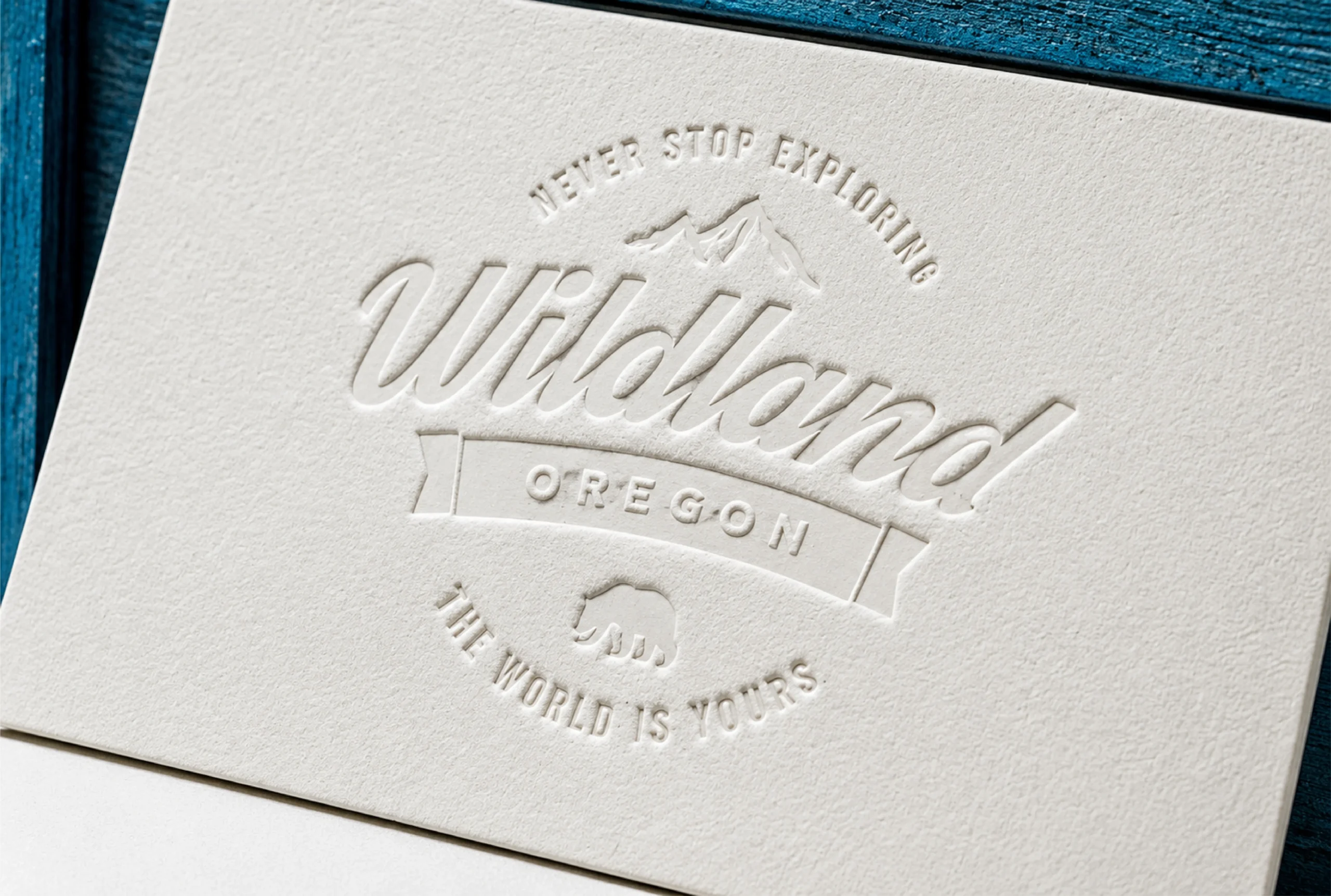
We use debossing technique to add unique graphics into your packaging.
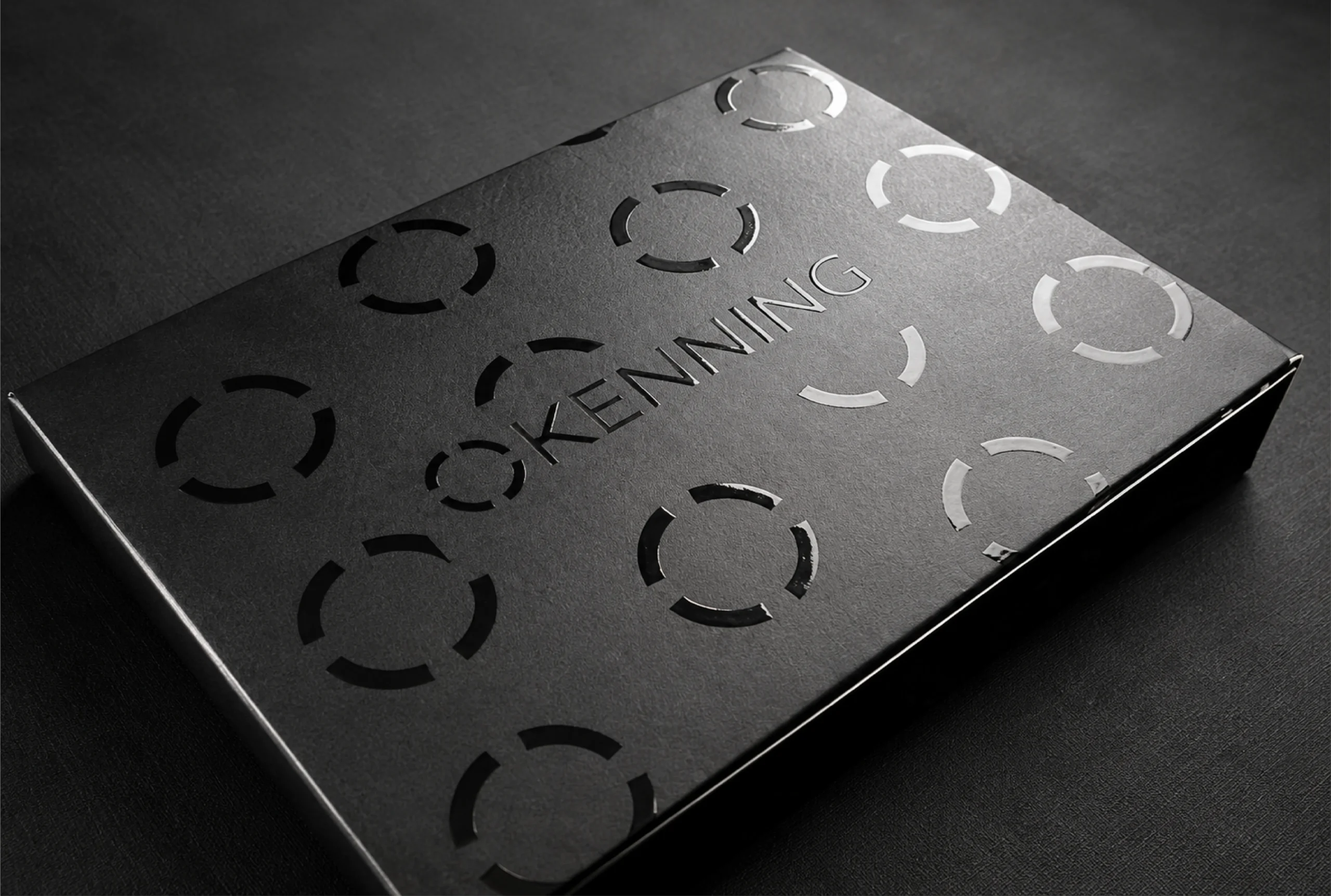
Our high-gloss UV coating gives light and shine to cure the printed material's varnish.
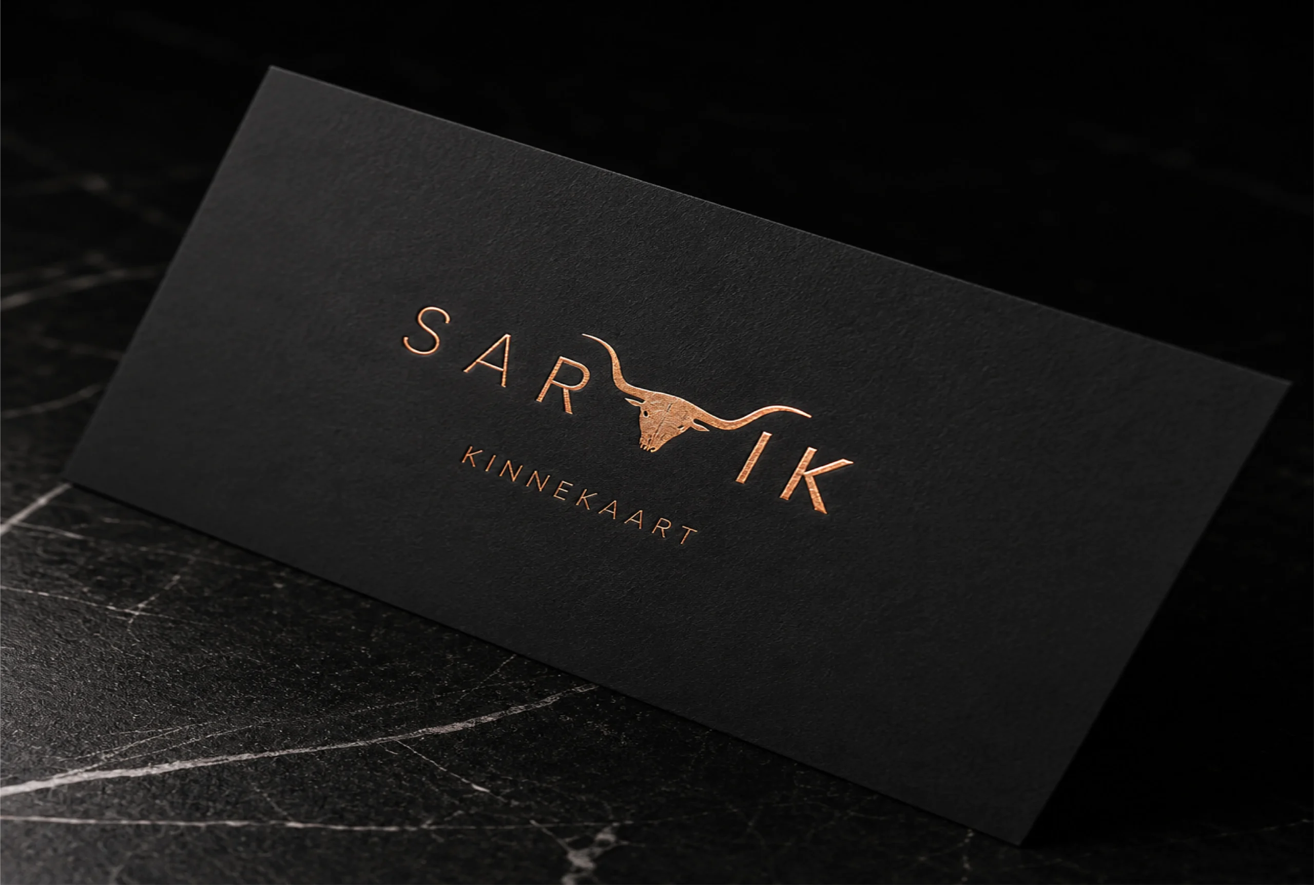
We add additional layer of protection with soft touch lamination from toner chipping.
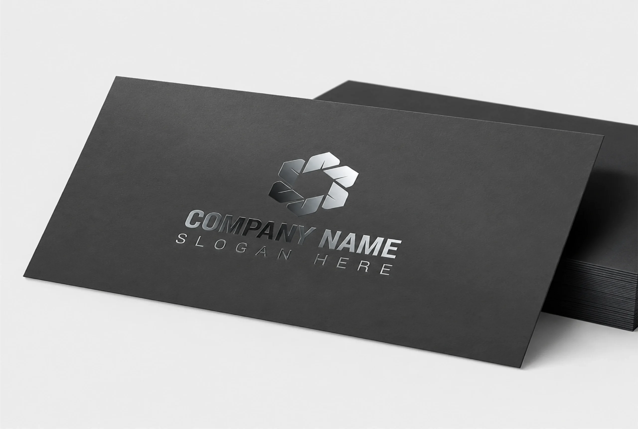
With our matte finish, fingerprints and smudges will now be less visible on the packaging.

Custom reverse tuck boxes from Pioneer Custom Boxes help supplement, cosmetic, skincare, food, pharmacy, hardware and ecommerce brands package products at a lower unit cost. Choose SBS or kraft board from 14pt to 24pt, custom sizes, windows, inserts, foil, lamination, logo printing, free design support, no MOQ and free USA shipping.
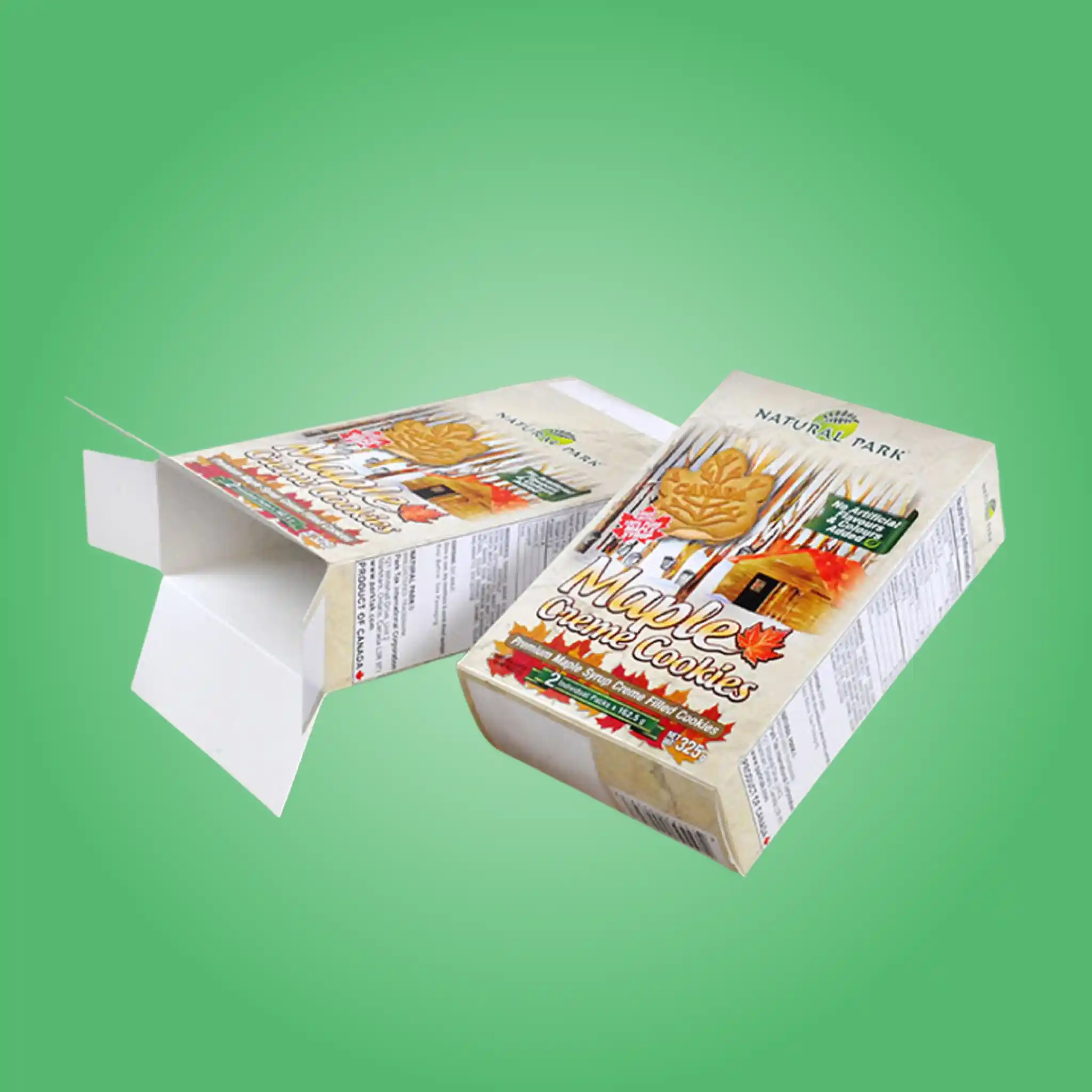
Custom seal end tuck boxes from Pioneer Custom Boxes help food, cereal, pharmacy, hardware, detergent and pet brands package products with glued ends, tamper evidence and high line speed. Choose SBS, CRB or kraft board, barrier liners, sift-proof seals, tear perforations, windows, logo printing, free design support, no MOQ and free USA shipping.
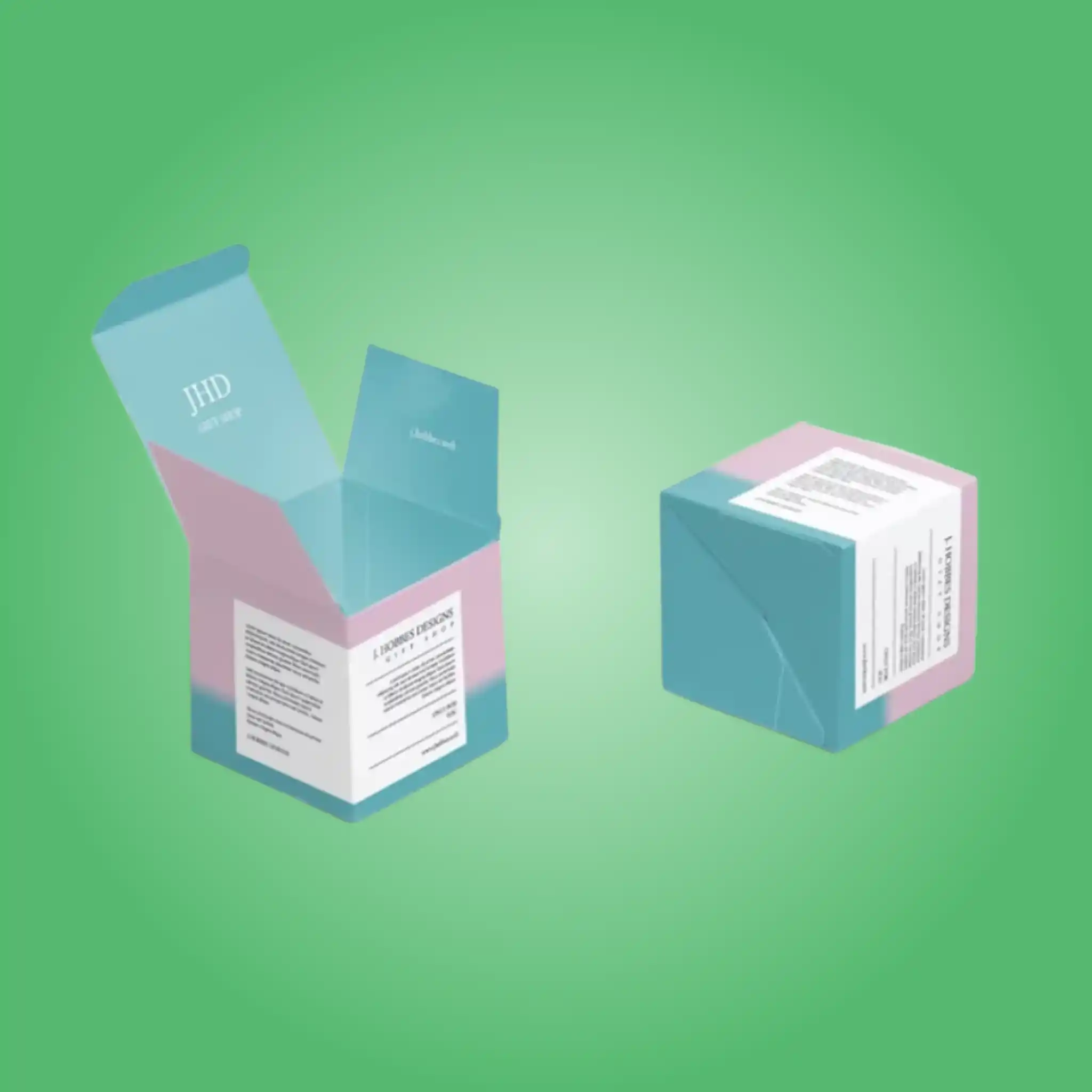
Custom tuck end boxes from Pioneer Custom Boxes help cosmetic, skincare, supplement, food, candle, soap, electronics and ecommerce brands package products without tape or glue. Choose straight tuck, reverse tuck, auto-lock or roll end styles in SBS, kraft, CRB or E-flute, with windows, inserts, foil, lamination, free design support, no MOQ and free USA shipping.

Roll end tuck front boxes from Pioneer Custom Boxes help subscription, beauty, apparel, gifting, food and ecommerce brands present products with a full lid opening and a printed interior. Choose E-flute, B-flute, kraft or SBS board, custom sizes, fitted trays, dividers, foil, coatings, free design support, no MOQ and free USA shipping.