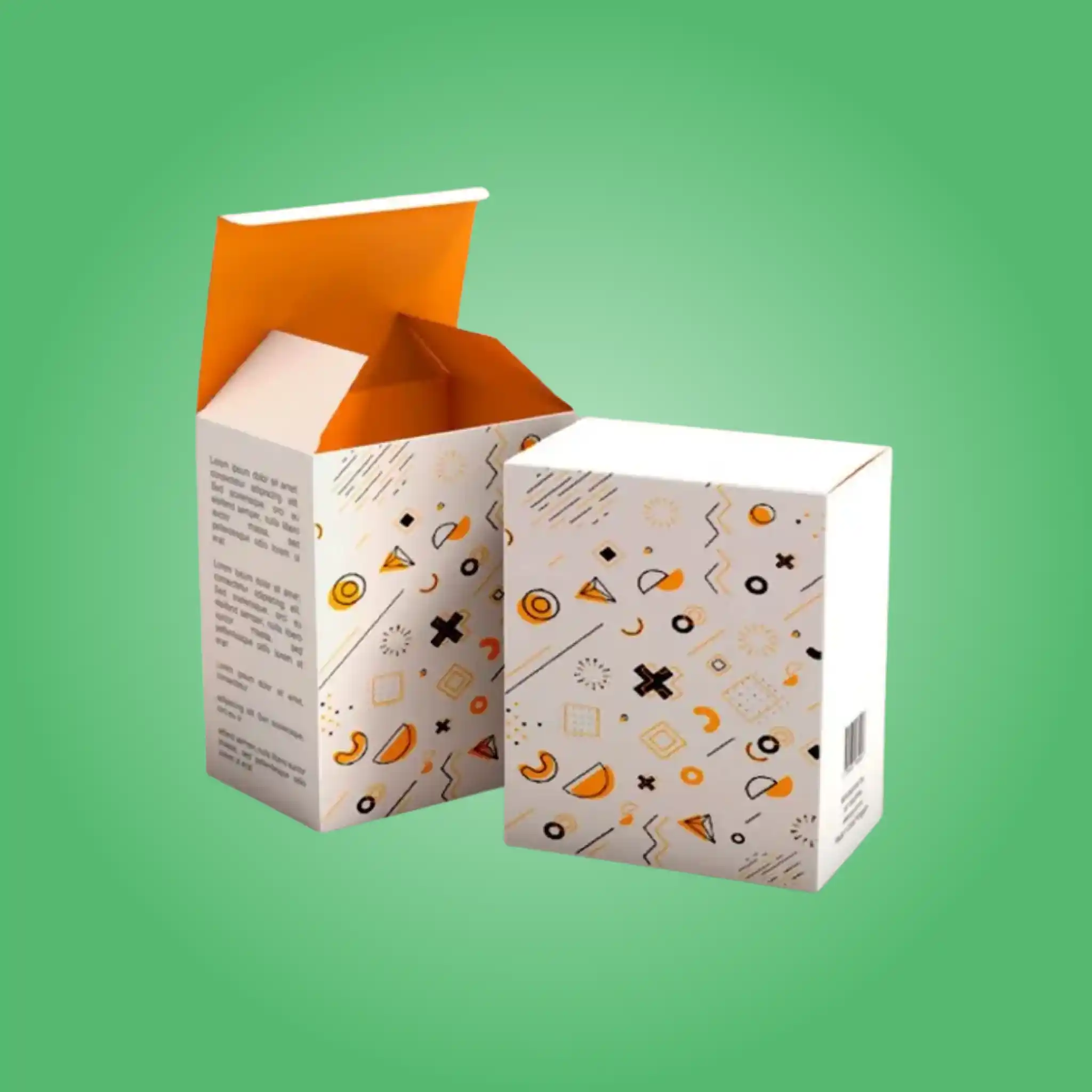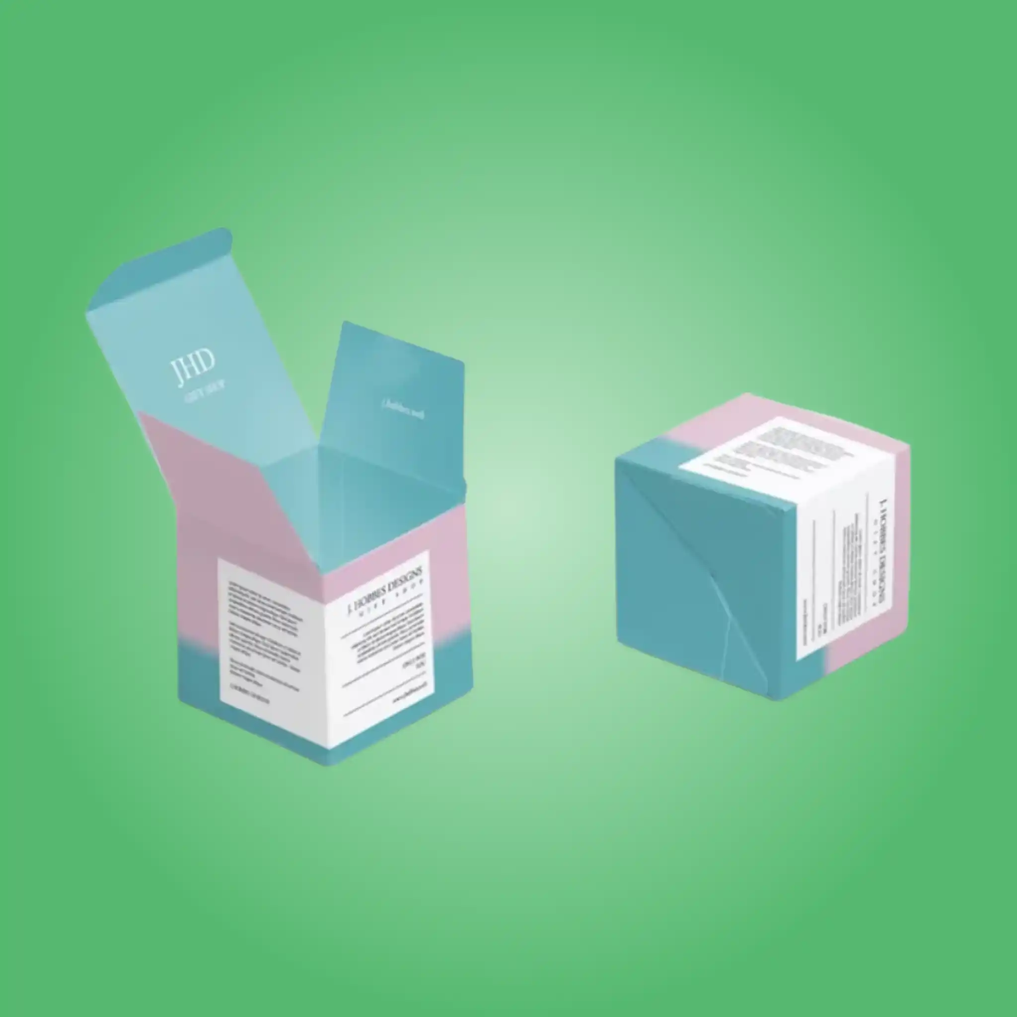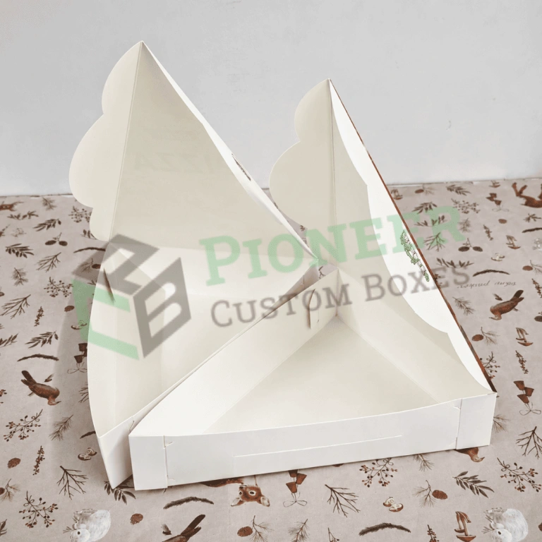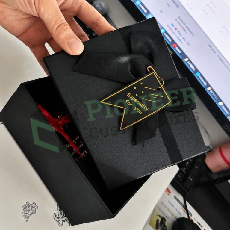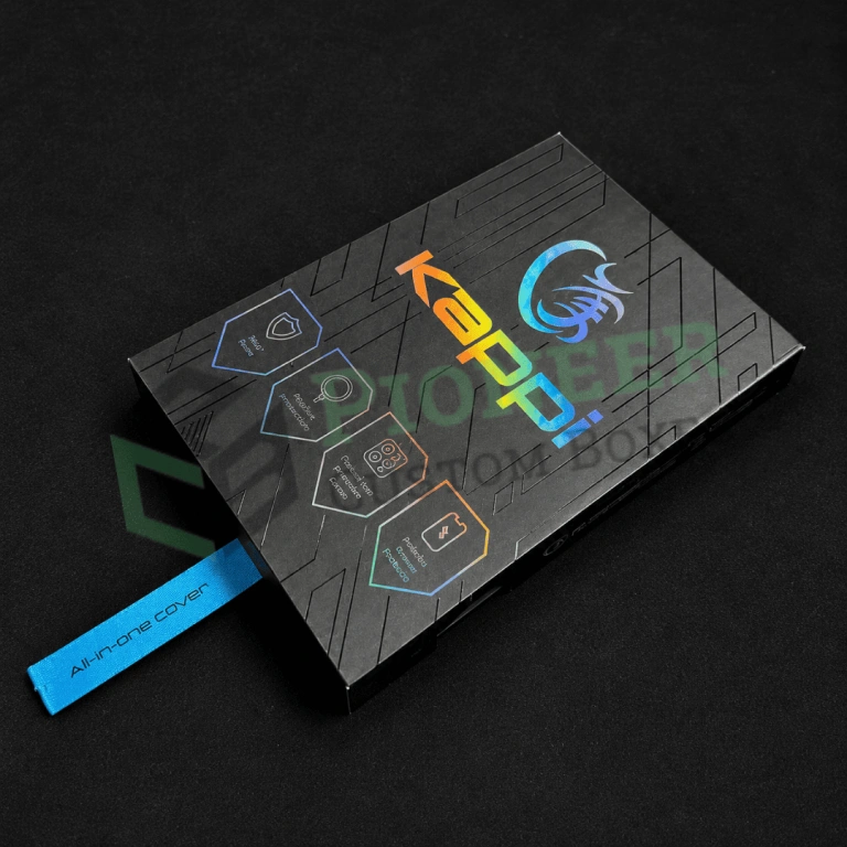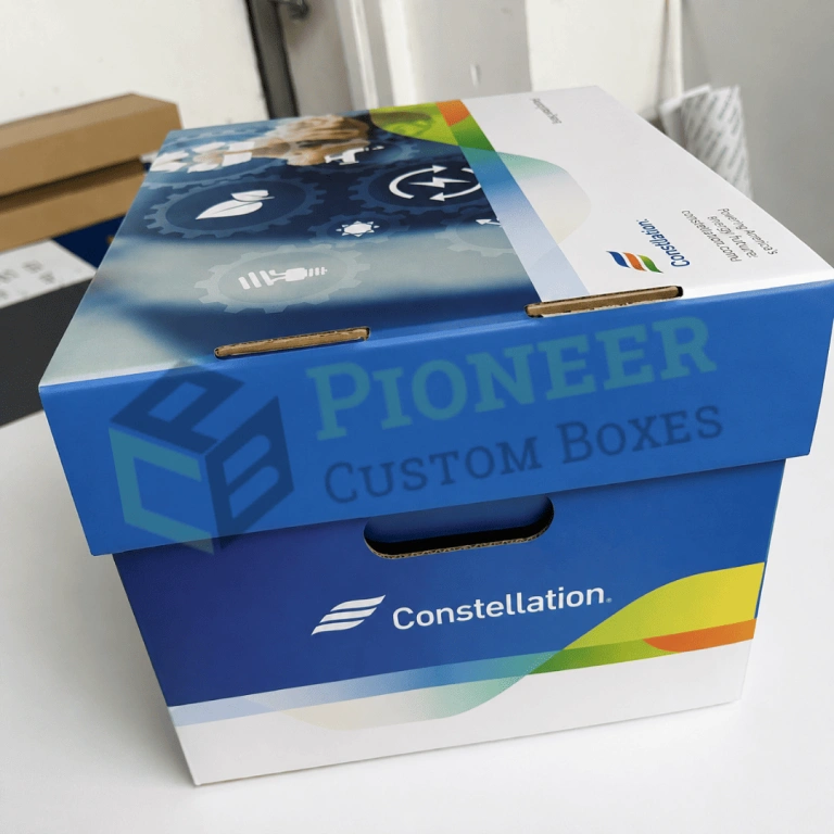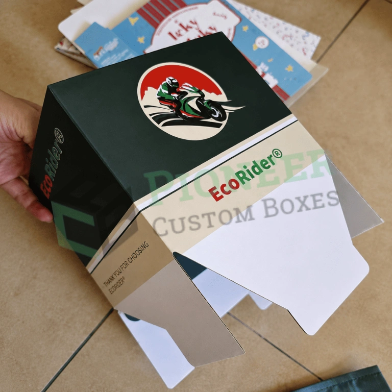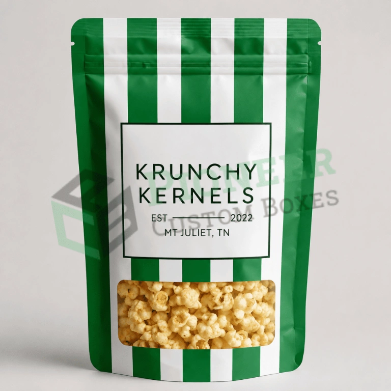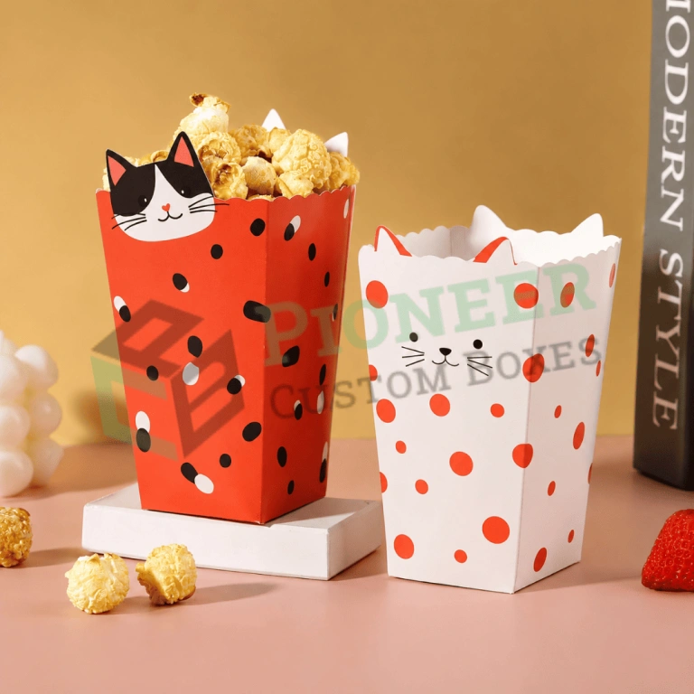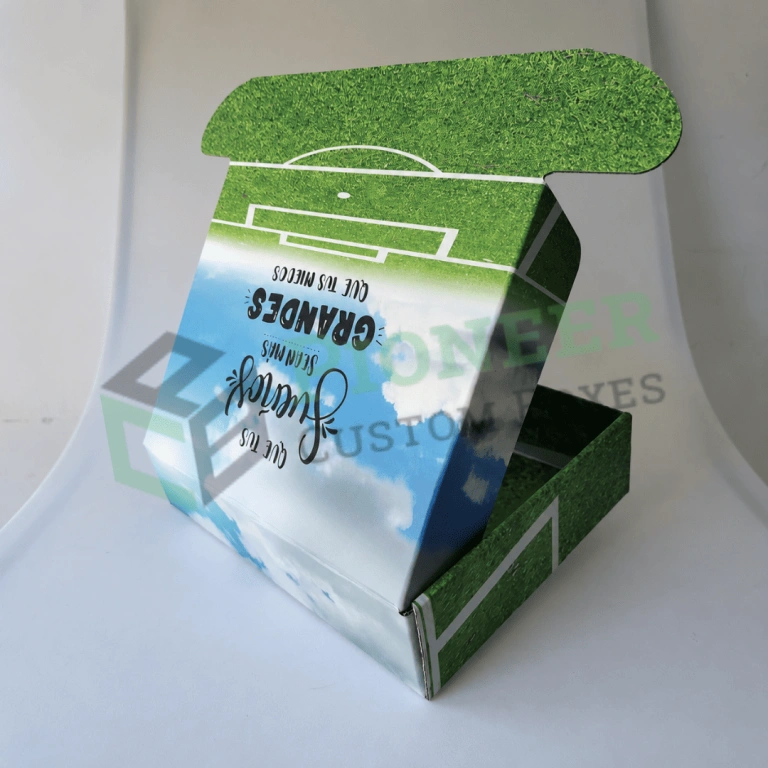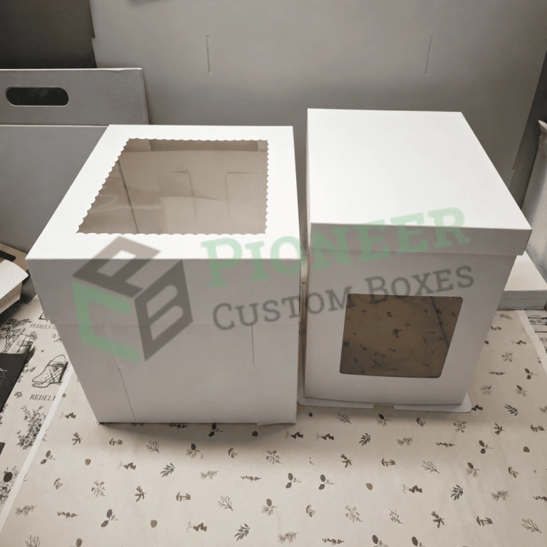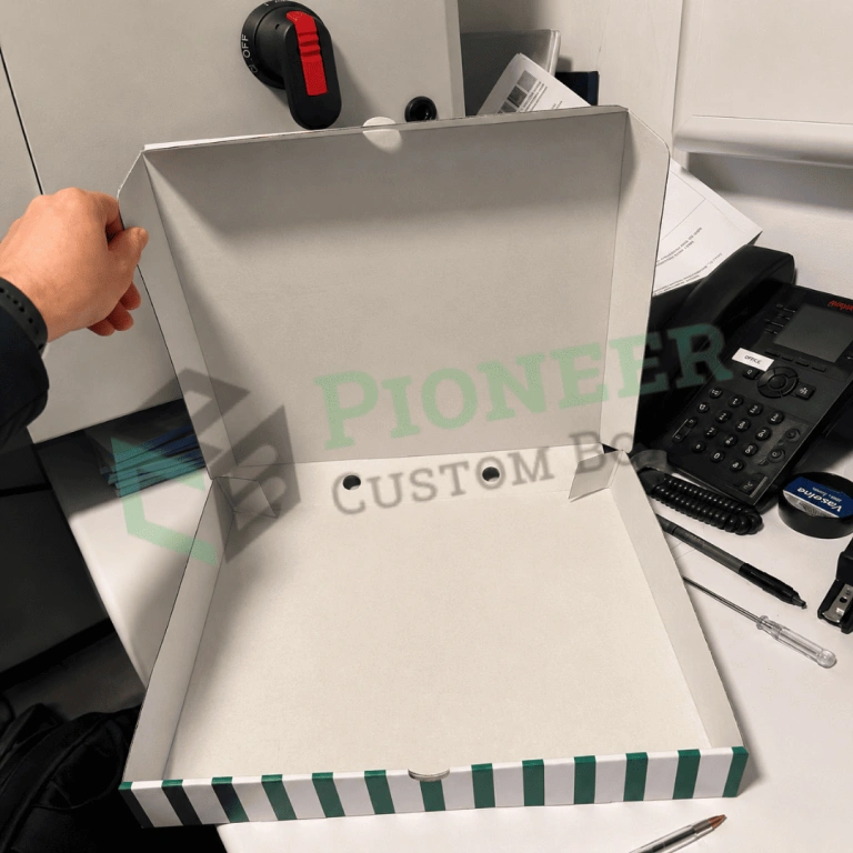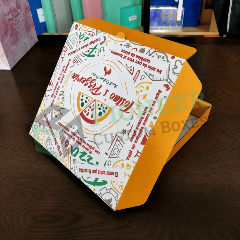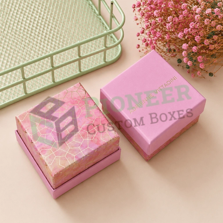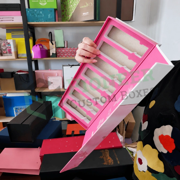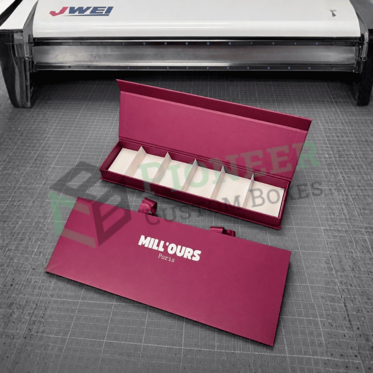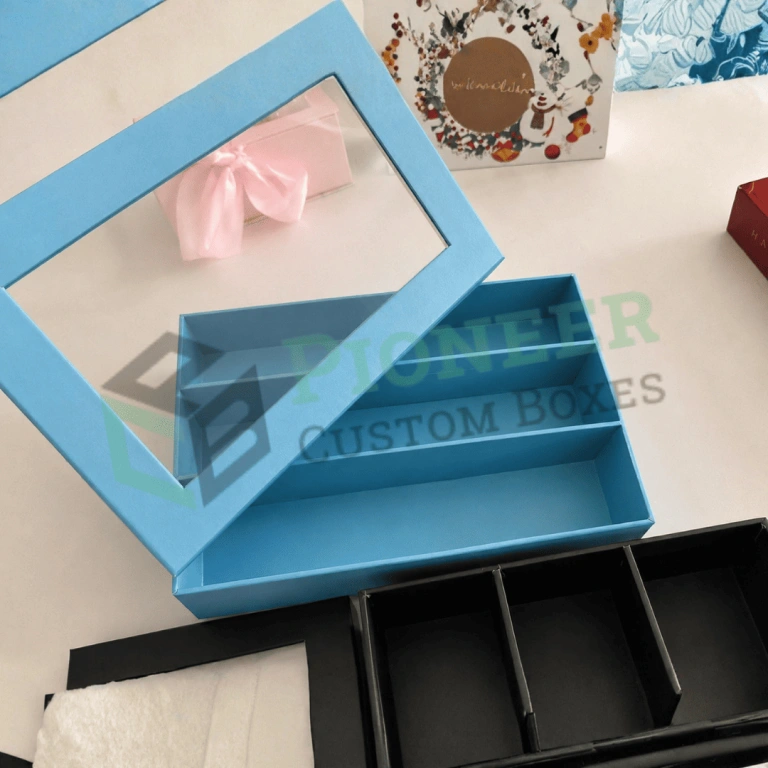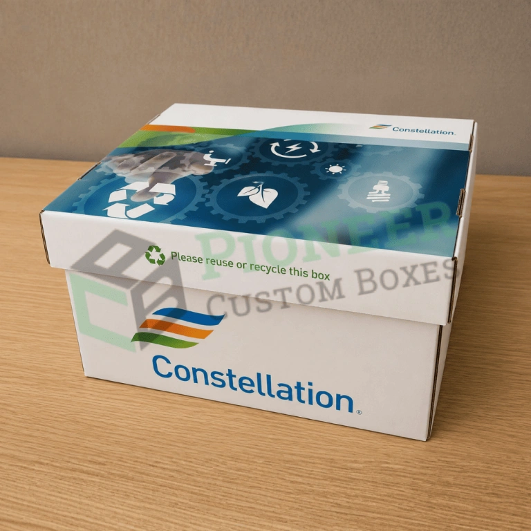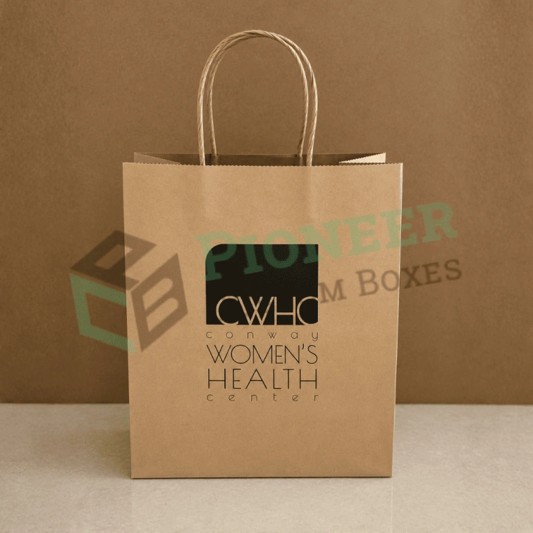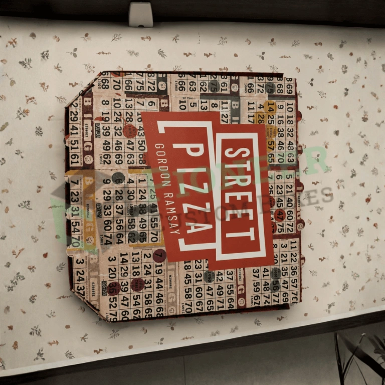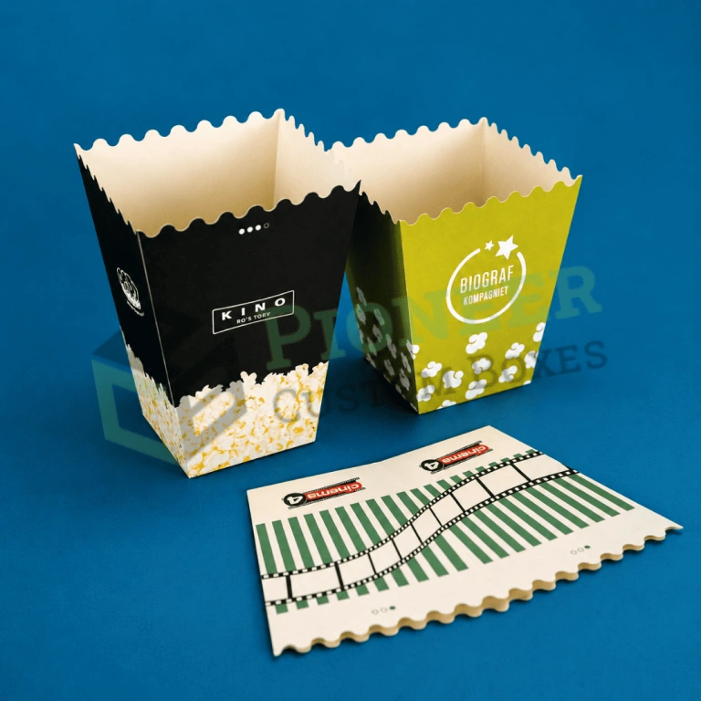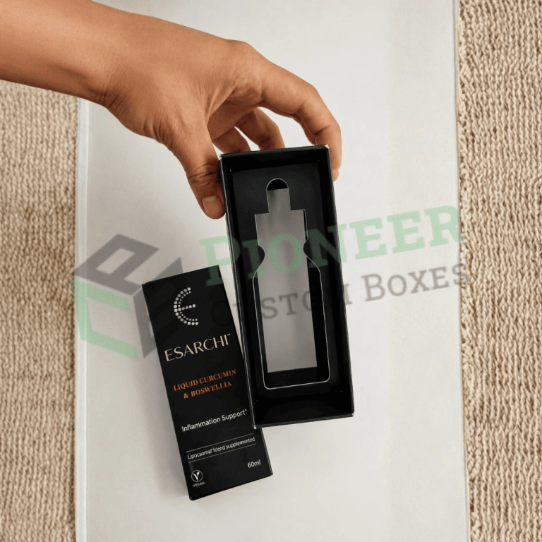
Custom reverse tuck boxes from Pioneer Custom Boxes help supplement, cosmetic, skincare, food, pharmacy, hardware and ecommerce brands package products at a lower unit cost. Choose SBS or kraft board from 14pt to 24pt, custom sizes, windows, inserts, foil, lamination, logo printing, free design support, no MOQ and free USA shipping.
Custom reverse tuck boxes close with their two end flaps folding in opposite directions. The top flap hinges from the back panel and the bottom flap hinges from the front, so both tucks share the same die area rather than extending from a single panel. That geometry is the reason the reverse tuck end is the most widely produced folding carton in the country.
The advantage is material. A reverse tuck blank is smaller than a straight tuck of identical internal dimensions, and it nests more tightly on a press sheet, so you get more cartons from every sheet of board. On a product shipping millions of units a year, that efficiency is not a rounding error.
The second advantage is speed on the packing line. Because the bottom flap folds away from the operator, the carton stays open while product goes in. Hand-packing operations consistently move faster on reverse tucks than on any other tuck style.
Pioneer Custom Boxes manufactures reverse tuck cartons in the United States. We cut our own dies, run our own presses and finish every order in house, with zero minimum order quantity, free dielines and free shipping nationwide.
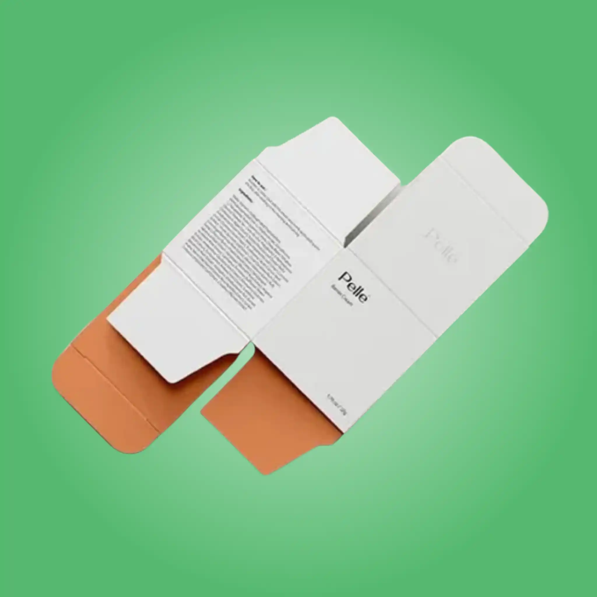
The carton starts as one flat blank. Four panels wrap around the product and glue to a narrow tab, forming the body. Flaps then extend from those panels to close each end, and the direction of those flaps defines the style.
On a reverse tuck, the top flap extends from the rear panel and the bottom flap extends from the front panel. They fold toward each other rather than in the same direction. Each carries a tuck tab that slots into a slit on the opposite panel, with dust flaps closing first at either side to seal the end and stiffen the carton.
Because the flaps originate on opposite panels, the die lays out compactly. Less board is trimmed as waste, more blanks fit per sheet, and the finished carton costs less than an equivalent straight tuck. That is the whole commercial argument for the style, and for high-volume products it is decisive.
The visible consequence is a hinge line and tuck slit on the front panel. On busy artwork with photography or pattern, nobody notices it. On a minimal design with a large field of flat brand color, that line interrupts the face.
We can specify friction-lock tucks on either end, where the tab is cut with small ears that grip the slit. That stops cartons springing open inside a shipping case, and it adds nothing to the die cost.
These two styles look nearly identical as flat blanks and behave differently in every way that affects your cost and your shelf presence.
A reverse tuck uses less board, nests better on the sheet and fills faster by hand. Those three advantages compound at volume, which is why supplements, everyday cosmetics, food cartons and inner packs overwhelmingly use this style.
A straight tuck folds both flaps in the same direction, keeping every seam at the back and leaving the front panel completely clean. It costs slightly more per unit. For a premium product whose face carries minimal artwork, that clean panel is worth the difference.
There is a practical detail worth knowing. On a reverse tuck the two ends open in opposite directions, so a customer can open the carton from either end and may find the product upside down. Where orientation matters, we mark the intended opening end or specify a friction lock on the base so it stays closed.
| Factor | Reverse Tuck | Straight Tuck |
|---|---|---|
| Board consumption | Lower | Slightly higher |
| Sheet nesting | More efficient | Less efficient |
| Hand filling speed | Fastest of the tuck styles | Good |
| Front panel | One visible hinge and slit | Completely uninterrupted |
| Opening motion | Opposite at each end | Consistent both ends |
| Best fit | High-volume retail and inner packs | Premium retail faces |
If your product sits between the two cases, we will produce a physical sample of each from your dimensions at no charge. Holding both settles the question faster than any specification sheet.
Every die is cut to your measured product, so nothing below is a fixed catalog. These are the formats we produce most frequently and they are useful reference points before you measure.
| Application | Typical Size (inches) | Caliper | Structural Note |
|---|---|---|---|
| Supplement bottle | 2.5 x 2.5 x 5 | 18pt SBS | Highest-volume format in this style |
| Cream and moisturizer jar | 3 x 3 x 3 | 18pt SBS | Fast hand filling |
| Serum and dropper bottle | 1.5 x 1.5 x 4 | 16pt SBS | Insert for glass |
| Skincare tube | 1.75 x 1.5 x 6 | 16pt SBS | Tall narrow proportion |
| Soap bar | 3.5 x 2.5 x 1.25 | 16pt kraft or SBS | Window optional |
| Snack and dry food carton | 4 x 2.5 x 6 | 18pt food board | Barrier liner where required |
| Pharmacy and OTC carton | 2 x 1.5 x 4 | 18pt SBS | Space for required text |
| Hardware and accessory | 5 x 3 x 1.5 | 16pt | Paperboard insert |
| Inner pack carton | 6 x 4 x 2 | 14pt to 16pt | Cost-led specification |
| Sample and travel size | 1.25 x 1.25 x 2.5 | 14pt | Lowest cost per unit |
Send your product dimensions and quantity and we return a free dieline sized precisely to them within one business day.
Sizing decides whether a reverse tuck carton performs or frustrates, and it is settled entirely before anything reaches a press.
Every dimension we quote is internal, measured to the inside faces of the assembled carton. Board has real thickness, so an 18pt carton finishes about a millimeter larger externally on each axis. Brands that send external dimensions receive a carton their product will not fit, and that is the most common sizing error we correct.
Clearance should be deliberate. Around a rigid item such as a bottle or a jar, one to two millimeters on each side lets the product drop in cleanly without rattling. More than that and the product shifts during transit, scuffing the printed panels from the inside and letting the carton buckle under stacking pressure.
Height matters especially on this style, because both tucks have to close over the product. A carton cut exactly to product height forces staff to press each flap down against the item, which cracks scores over a production run. We build in a small controlled headroom so the closure works without strain.
For variable products such as hand-filled pouches or artisan bars, we size to the largest realistic unit rather than a nominal one. A carton cut to the average traps a meaningful share of your production.
Send us the product itself where you can. Measuring it here removes every assumption and costs you nothing but postage.
Board choice controls print quality, folding behavior and whether the carton survives a stockroom. Every option below runs on the same die, so you can compare without new tooling.
Solid bleached sulfate is the standard for printed retail cartons. The bright white clay-coated surface reproduces photography and brand colors accurately, scores cleanly and accepts lamination, foil and spot UV without difficulty. We run 14pt for very light items, 16pt to 18pt across most cosmetic, supplement and food work, and 20pt to 24pt where a filled glass container demands rigidity.
Kraft carries a natural brown surface suited to organic, refill and artisan positioning, and it costs less than bleached stock. Inks print warmer on kraft and white will not read as white, so kraft designs generally use one or two bold colors. Since reverse tucks are frequently chosen to control cost, kraft with two-color print is a genuinely economical combination.
E-flute suits reverse tuck cartons that ship alone through a parcel network rather than inside an outer case. The fluted layer adds real crush resistance while still printing acceptably, and it handles heavier products safely.
Both SBS and kraft are available with post-consumer recycled content and FSC certification. We document exactly what your board contains so any sustainability claim you publish is accurate rather than assumed.
Because this style is often specified to reduce cost, caliper is where brands most often go too far. Dropping board to save a fraction of a cent produces cartons that bow during filling and crease in a stockroom, and the resulting scrap costs far more than the saving. We specify against the loaded weight and the real stack height rather than the theoretical minimum.
| Material | Typical Caliper | Strengths | Best For | Relative Cost |
|---|---|---|---|---|
| SBS paperboard | 14pt to 24pt | Bright white face, sharp print | Retail cartons judged on shelf | Moderate |
| Kraft paperboard | 16pt to 24pt | Natural look, hides marking | Organic and artisan positioning | Lower |
| Coated recycled board | 16pt to 22pt | Recycled content under a print face | High-volume ranges on cost | Lower |
| E-flute corrugated | 32 ECT typical | Impact and crush resistance | Heavier products and parcel shipping | Higher |
| Recycled and FSC-certified stocks | Any grade above | Documented sourcing and content | Brands audited on sustainability | Small premium |
Print method decides both appearance and unit cost, so we quote each option separately rather than bundling them.
Offset runs from metal plates and delivers the sharpest reproduction available on paperboard. Gradients stay smooth, small type stays crisp, and color holds steady from the first sheet to the last. Because reverse tuck cartons are usually produced in volume, most orders in this style reach the quantity where offset is clearly the right economics. The plate charge is a one-time cost per design and unit price falls steadily as the run grows.
Offset also matters when several SKUs sit together on a shelf. Color drift between production batches is visible when a range is displayed as a block, and plates hold that consistency far better than any alternative.
Digital prints straight from the file with no plates, so setup cost disappears entirely. That makes a run of two hundred cartons as practical as a run of two thousand, which is what allows genuine zero minimum order quantity. Digital also supports variable data, so a single run can carry different flavors, strengths or batch codes on individual cartons.
For brands with many SKUs at modest volumes, digital on one shared die is usually the cheapest route to a complete range, because you avoid a separate plate set for every variant.
Flexo prints from flexible plates and suits corrugated stock rather than fine folding board. Your retail reverse tuck will not normally run flexo, though the shipping case carrying it usually will.
| Method | Best Quantity | Strengths | Limitations | Use It For |
|---|---|---|---|---|
| Offset printing | 1,000 and above | Finest detail, steadiest color | Plate cost per design | Core retail runs |
| Digital printing | 1 to 1,000 | No plates, unlimited variants | Cost flattens at volume | Launches and wide SKU ranges |
| Flexographic printing | 5,000 and above | Economical on kraft and fluted board | Coarser gradients | Outers, cases and kraft cartons |
Most color disappointments come from mixing up these three systems rather than from anything going wrong on press.
CMYK builds every color from cyan, magenta, yellow and black separations. It reproduces photography, product imagery and gradients convincingly and costs the least, since four inks cover the entire design however complex it is. Vivid, pastel and metallic shades sit outside its achievable range, so brands with a signature color normally pair CMYK artwork with one spot ink.
Pantone inks arrive pre-mixed, so a specified shade prints identically on every run and across board types. If customers recognize your brand by a color, that color belongs in PMS. Each spot ink occupies its own press unit, so the count affects cost directly. We store your references permanently and match against a physical draw-down before every run, which keeps your tenth reorder matching your first.
RGB is a screen color space and cannot be printed directly. Websites, marketplace listings and social assets all live in RGB, and conversion shifts saturated colors noticeably, most obviously in bright blues and greens. We run that conversion ourselves and show you the printed outcome before the full run, so the carton matches what buyers saw online. Supply artwork in CMYK or with Pantone references wherever possible.
| Color System | Where It Lives | Consistency Across Runs | Use It For |
|---|---|---|---|
| CMYK | Print, four process inks | Good, drifts on pale and deep tones | Photography and gradients |
| PMS spot | Print, pre-mixed ink | Exact, run after run | Brand colors and range bands |
| RGB | Screens only | Cannot be printed directly | Web and marketplace imagery |
Finishing is priced as separate passes through the plant, so you keep only what earns its cost. On a reverse tuck, one detail is worth planning: the front panel carries a hinge line, so heavy finishing across that whole face draws attention to it rather than away.
Matte film gives a soft, restrained surface that resists scuffing and makes foil or spot UV stand out sharply by contrast. It is the most common base finish across premium reverse tuck work.
Gloss raises color saturation and makes photography look vivid under retail lighting, while resisting moisture and handling well. It shows fingerprints, so it suits busy artwork more than large flat dark panels. On this style gloss is also useful because it de-emphasizes the front hinge line under reflection.
Soft touch produces a velvet surface that feels considerably more expensive than it costs, and it resists fingerprints in a way gloss does not. Premium supplement and skincare brands specify it as a default base.
Hot foil presses metallic film into the board under heat and pressure. A single foil hit on the logo costs a fraction of full coverage and reads almost identically to customers. On a reverse tuck we usually position foil away from the front hinge so nothing competes with it.
Spot UV applies high-gloss varnish to chosen areas only, creating contrast you can see and feel against matte lamination. Keep it clear of the barcode, since gloss causes scanning failures at checkout.
Embossing raises an area of board and debossing presses it in. Both add texture customers register through touch before conscious thought, and a deboss combined with foil produces the crisp jeweled effect common on premium retail cartons.
Where full lamination is unnecessary, a gloss or matte aqueous coating protects the printed surface at lower cost and keeps the carton more readily recyclable. For high-volume cartons discarded soon after purchase, this is often the sensible choice.
| Finish | Effect | Durability | Recycling Impact | Best For |
|---|---|---|---|---|
| Matte lamination | Flat, soft, hides handling | High | Complicates recovery | Premium retail cartons |
| Gloss lamination | High shine, deep color | High | Complicates recovery | Bold color-led designs |
| Soft touch lamination | Velvet hand feel | High | Complicates recovery | Prestige positioning |
| Aqueous coating | Sealed, scuff resistant | Moderate | Minimal, stays recyclable | Everyday retail and shipping |
| Foil stamping | Metallic premium cue | High | Minimal at small coverage | Logos and rules |
| Spot UV coating | Selective gloss on matte | Moderate | Minimal | Patterns behind a logo |
| Embossing and debossing | Tactile raised or recessed detail | High | None | Registered detail with foil |
Structural extras change how the carton performs in a store, in a warehouse and in a customer hand. Each is quoted separately so you can see what it costs.
| Add-On | What It Does | Best Suited To |
|---|---|---|
| Die-cut window | Shows the product without opening | Soap, snacks, gift items |
| PET window film | Keeps dust off while product stays visible | Retail shelf products |
| Paperboard insert | Holds the product centered and still | Glass bottles and jars |
| Multi-cavity divider | Separates several items in one carton | Sample and variety packs |
| Hang tab | Allows peg display | Small accessories and impulse items |
| Tear strip | Opens cleanly without tools | Sealed and subscription goods |
| Friction lock tucks | Stops the carton springing open | Cartons shipped loose |
| Printed interior | Extends the unboxing moment | Direct-to-consumer brands |
| Tamper-evident seal | Shows if the carton was opened | Supplements and ingestibles |
| Braille or tactile mark | Meets accessibility requirements | Pharmacy and OTC products |
On a reverse tuck, place a window on the back panel where possible. That face has no hinge crossing it, so the aperture sits cleanly and the die is simpler.
Brands choose this style to control cost, so it is worth knowing precisely which variables move the number. Nearly all of them sit within your control.
Carton dimensions lead, because board is priced by area. Removing a quarter inch of unnecessary clearance from each dimension cuts material on every unit forever, and it usually improves how the product sits inside as well.
Sheet yield follows, and it is the variable most buyers never see. Blanks nest on a press sheet like puzzle pieces, and adjusting a dimension slightly sometimes fits an extra row per sheet. We test nesting before quoting, and we will tell you when a small dimensional change pays for itself.
Caliper is third. Going lighter to save a fraction of a cent is the classic false economy in this style, because cartons that bow during filling generate scrap that dwarfs the saving. Finishing and spot color count follow, then quantity, since plate and setup costs spread across the run.
| Cost Driver | Impact | How to Reduce It |
|---|---|---|
| Carton dimensions | Highest | Measure precisely and remove excess clearance |
| Sheet nesting yield | High | Let us adjust dimensions slightly for a better fit |
| Board caliper | High | Match thickness to loaded weight, not to the minimum |
| Finishing passes | High | Aqueous coating instead of full lamination at volume |
| Spot color count | Moderate | CMYK artwork plus one Pantone brand color |
| Number of SKUs | High | One die, vary only the printed panel |
| Order quantity | Moderate | Digital under a thousand, offset above |
The single largest saving available to most brands is running an entire product range through one die and changing only the printed panel. The tooling exists, the fit is proven, and every variant shares the setup.
Folding cartons show defects clearly, and retailers reject them for faults a shipping box would survive. Every order passes a documented check before it leaves our floor.
| Check | What We Verify | Why It Matters |
|---|---|---|
| Dimensional accuracy | Internal fit against the approved dieline | A tight carton buckles during filling |
| Tuck flap fit, both ends | Each tab seats fully without forcing | Reverse tucks have two different closures |
| Score and crease quality | Clean folds with no cracking | Cracked creases expose white board edges |
| Glue bond strength | Seam pull test on finished cartons | A failed seam opens in transit |
| Assembly timing | A carton filled by hand from the run | Filling speed is why you chose this style |
| Print registration | Artwork aligned to cut and fold lines | Misregistration is visible on shelf |
| Color match | Pantone against a physical draw-down | Ranges displayed together show any drift |
| Lamination adhesion | Edge lift and corner bond | Peeling film reaches the customer looking cheap |
| Foil adhesion | Tape test on stamped areas | Lifting foil ruins premium positioning |
| Barcode readability | Scan test on a flat matte area | Retailers reject unscannable cartons |
If anything fails, we remake it rather than ship it.
Supplement and nutraceutical brands use reverse tuck cartons more than any other structure. Volumes are high, margins are managed carefully, and the format gives enough panel space for supplement facts, directions and warning statements while holding unit cost down. A single die across a whole range, with only the printed panel changing between products, is the standard approach in this sector.
Everyday cosmetics and personal care follow closely. A reverse tuck holds a tube, a bottle or a jar securely, prints beautifully in full color and fills quickly on both hand and automated lines. Brands typically reserve straight tuck cartons for their premium tier and run everything else as reverse tucks.
Food and confectionery brands use them for dry goods, snack cartons, cereal-style packs and inner cartons, normally with a barrier liner handling direct product contact. The efficiency matters here because volumes are large and the packaging is discarded quickly.
Pharmacy and over-the-counter products use them because required panel content lays out cleanly across the faces and the format runs reliably on automated cartoning lines. Braille and tactile marks can be added where accessibility rules apply.
Hardware, accessory and consumer electronics brands use them with a paperboard insert holding a small item in position, which turns a low-cost carton into a presentable retail pack. Soap, candle and home fragrance makers use them where cost matters more than a perfectly clean front face.
Wherever volume is high and your front panel is not carrying minimal premium artwork, the reverse tuck is usually the correct answer.
A carton that looks right and fills badly costs money every shift, so we test assembly before you commit to a run.
Reverse tuck cartons are the format most automated cartoning lines are configured around. Tolerances need to be held tightly, board stiffness needs to be consistent across the run, and glue tabs must sit within a narrow range. Board that varies slightly jams a feeder, and a line stoppage costs more per hour than the entire packaging order. Send us your equipment details and we build the dieline to those specifications.
For hand packing, this style usually wins on speed. The bottom flap folds away from the operator, so the carton stays open while product goes in, and the tuck closes with one motion. Across a shift that difference is measurable capacity rather than a theoretical advantage.
Headroom deserves a decision rather than a default. Excess clearance lets product shift and cartons collapse under stacking pressure, while too little slows filling and cracks scores as staff force flaps down. We test clearance against your actual product and recommend the smallest gap that still closes comfortably.
We fold a physical sample from every new die before production and time the assembly by hand. That check has saved clients from slow structures more than once.
Paperboard absorbs and releases moisture with the surrounding air, and that property causes most carton problems that appear after delivery rather than before it.
Cartons stored in a damp room soften and lose stiffness, so they bow during filling. Cartons stored somewhere very dry become brittle, and creases crack when folded. A stable indoor environment between roughly forty and sixty percent relative humidity keeps board behaving predictably.
Keep pallets off bare concrete, since concrete wicks moisture upward into the bottom cases. Leave shrink wrap intact until you need the stock, store flat cartons lying down rather than on edge, and rotate older cases forward so nothing sits absorbing whatever the room offers.
None of this needs equipment. It needs a dry indoor space and a little rotation discipline, and it protects the money you already spent.
The same errors recur on this style, and each is avoidable before a die is cut.
Sending external dimensions instead of internal leads the list. Board has real thickness, so a carton quoted externally finishes smaller inside than expected and the product no longer fits.
Going too light on caliper is the characteristic mistake of this style, precisely because it is chosen to control cost. A carton that saves a fraction of a cent and then bows during filling produces scrap worth many times the saving.
Placing critical artwork across the front hinge is third. A reverse tuck always has one hinge and tuck slit on the front panel, and a logo or a face positioned across it looks slightly wrong on every unit. Move the mark, or switch to a straight tuck.
Ignoring opening orientation causes avoidable customer confusion. Because the two ends open in opposite directions, a customer may open the base and find the product inverted. Mark the intended end or specify a friction lock on the base.
Finally, approving artwork without a physical sample. A fold running through a product image or a tuck stiffer than expected are both obvious in the hand and invisible on a screen. Samples take three to five business days and cost far less than a reprint.
A supplement brand came to us running fourteen products, each in a separately tooled carton ordered in small quantities. Their packaging cost per unit was higher than several of their ingredients.
The problem was fragmentation rather than price. Fourteen dies meant fourteen setups, and none of the runs reached a quantity where unit cost improved. Their bottles were also close enough in size that separate tooling was unnecessary.
We cut one reverse tuck die sized to their largest bottle with correct clearance for the rest, printed a shared 18pt SBS carton, and used digital printing to vary only the product panel and the color band. They ordered the full range in one production run instead of fourteen.
Unit cost fell by roughly thirty-eight percent. Their shelf improved as a side effect, because fourteen coordinated cartons read as a brand while fourteen different cartons read as a collection of one-offs. New flavors now join the range at no tooling cost at all.
Ordering runs through four steps and our team carries the technical work in each one.
First, send your product dimensions and quantity. If you have the product but no measurements, send photographs beside a ruler and we work the sizing out with you. Tell us whether you fill by hand or on a line, because that changes the specification.
Second, we return a free dieline and a written quote within one business day. The dieline maps every panel, crease, tuck slit, glue tab and bleed area on a single flat sheet, so your designer places artwork with certainty. That file stays yours permanently.
Third, you approve a digital proof showing artwork in position on the assembled structure. Request a physical sample whenever a structure or finish is new to you. Samples take three to five business days.
Fourth, we produce and ship. Standard production runs eight to twelve business days, rush production runs four to six, and shipping across the United States costs nothing. Reorders skip straight to production, because we keep your dieline, board specification, Pantone references and print files on record permanently.
Three things make custom reverse tuck boxes workable for a business of any size, and none carry a hidden charge.
Zero minimum order quantity means you order what you actually need. Fifty cartons and fifty thousand run on identical terms through the same process, with digital printing covering short runs so there is no plate cost to absorb.
Free design support covers structural work and artwork preparation. We build the dieline, position your logo, check that required panels stay legible and prepare print-ready files. If you already work with a designer, we supply a layered template marked with fold lines, bleed and safety margins.
Free shipping applies across the United States on every order, rush production included. We manufacture domestically, so lead times stay short and nothing waits at a port before your launch.
We are a direct manufacturer rather than a broker. We cut our own dies, run our own presses and finish every order in house, which is why we can quote quickly, adjust a specification mid-conversation and stand behind what leaves our floor.
That control shortens the correction cycle. When a first sample needs a dimensional change, we make it in days rather than sending it through intermediaries and waiting weeks.
Send us your product dimensions and your quantity, and we will return a free dieline and a written quote for custom reverse tuck boxes within one business day. Order now, or get a free quote and we will help you specify the right carton the first time.
| Box Style | Custom Reverse Tuck Boxes |
| Dimension (L + W + H) | All Custom Sizes & Shapes |
| Quantities | No Minimum Order Required |
| Paper Stock | 10pt to 28pt (60lb to 400lb) Eco-Friendly Kraft, E-flute Corrugated, Bux Board, Cardstock |
| Printing | No Printing, CMYK, CMYK + 1 PMS color, CMYK + 2 PMS colors |
| Finishing | Gloss Lamination, Matte Lamination, Gloss AQ, Gloss UV, Matte UV, Spot UV, Embossing, Foiling |
| Included Options | Die Cutting, Gluing, Scored, Perforation |
| Additional Options | Eco-Friendly, Recycled Boxes, Biodegradable |
| Proof | Flat View, 3D Mock-up, Physical Sampling (On request) |
| Turnaround | 4 – 8 Business Days, RUSH |
| Shipping | FLAT |
Every great product deserves packaging that turns heads. Here's how we make it happen — step by seamless step.
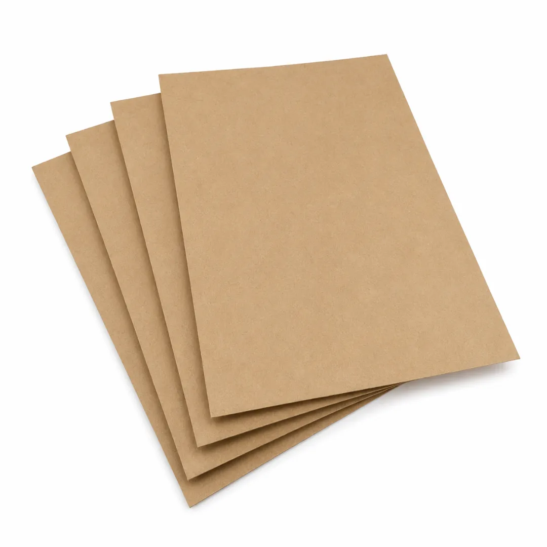
Kraft paper is a strong, durable and reliable material that is widely used across many different industries.
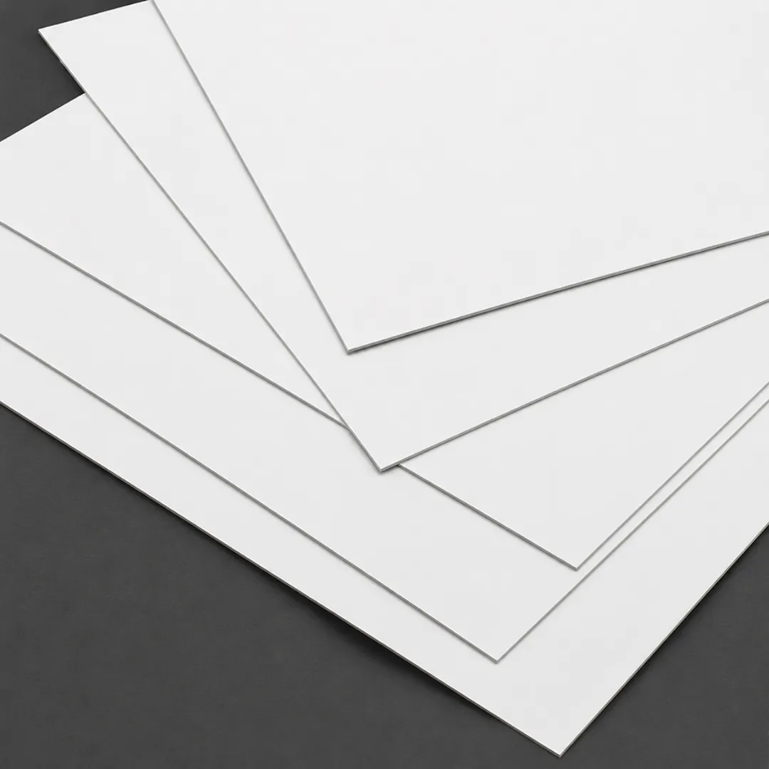
We use cardboard material with the least environmental impact and minimizes waste generation.
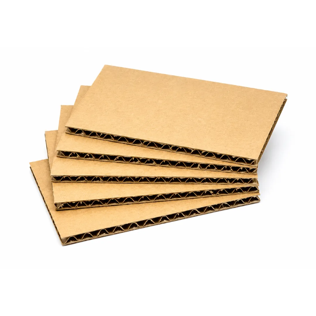
Corrugated material is easy to customize, cost effective and sustainable. It is also great for branding purposes.
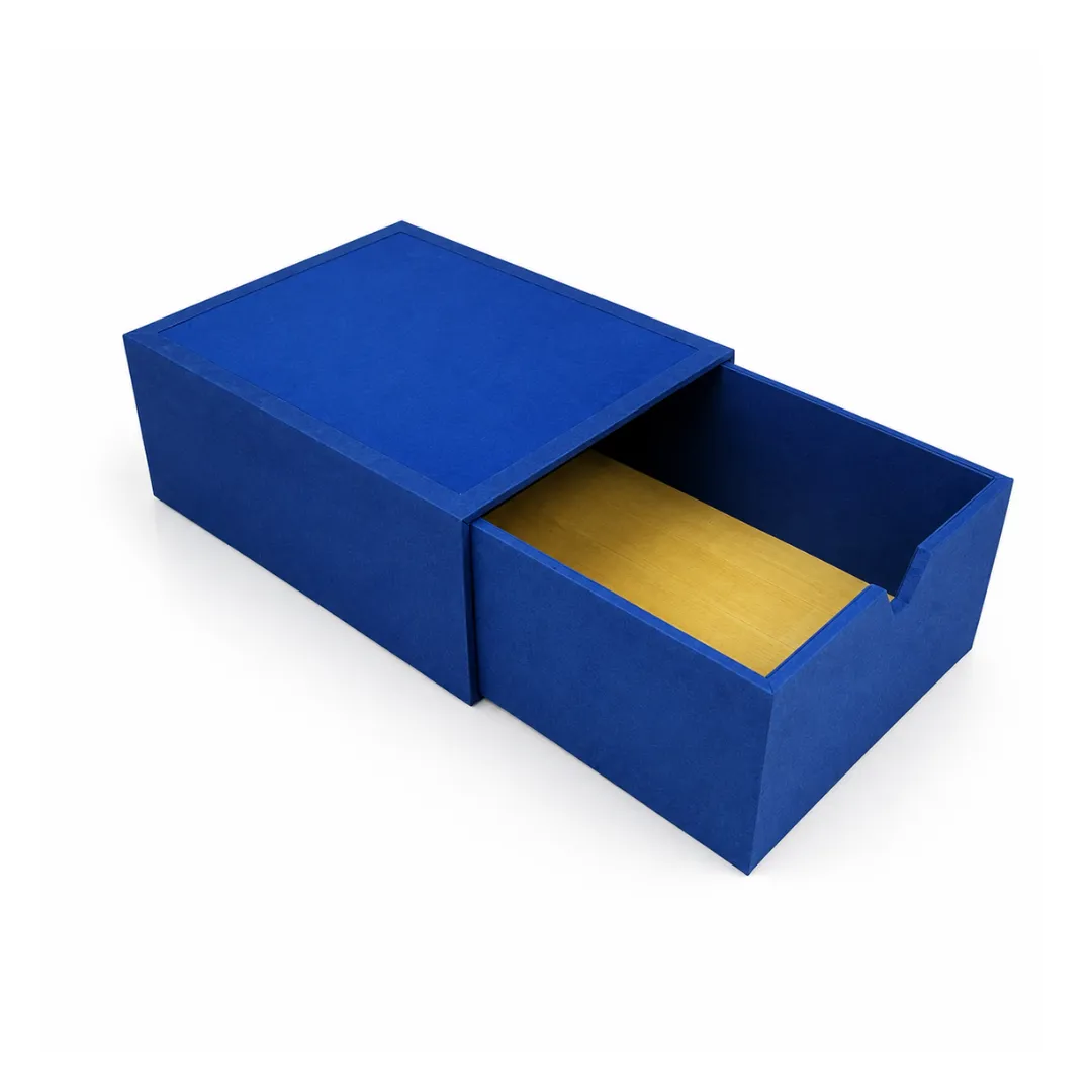
Rigid is highly protective, affordable and recyclable material. These boxes provide maximum protection.
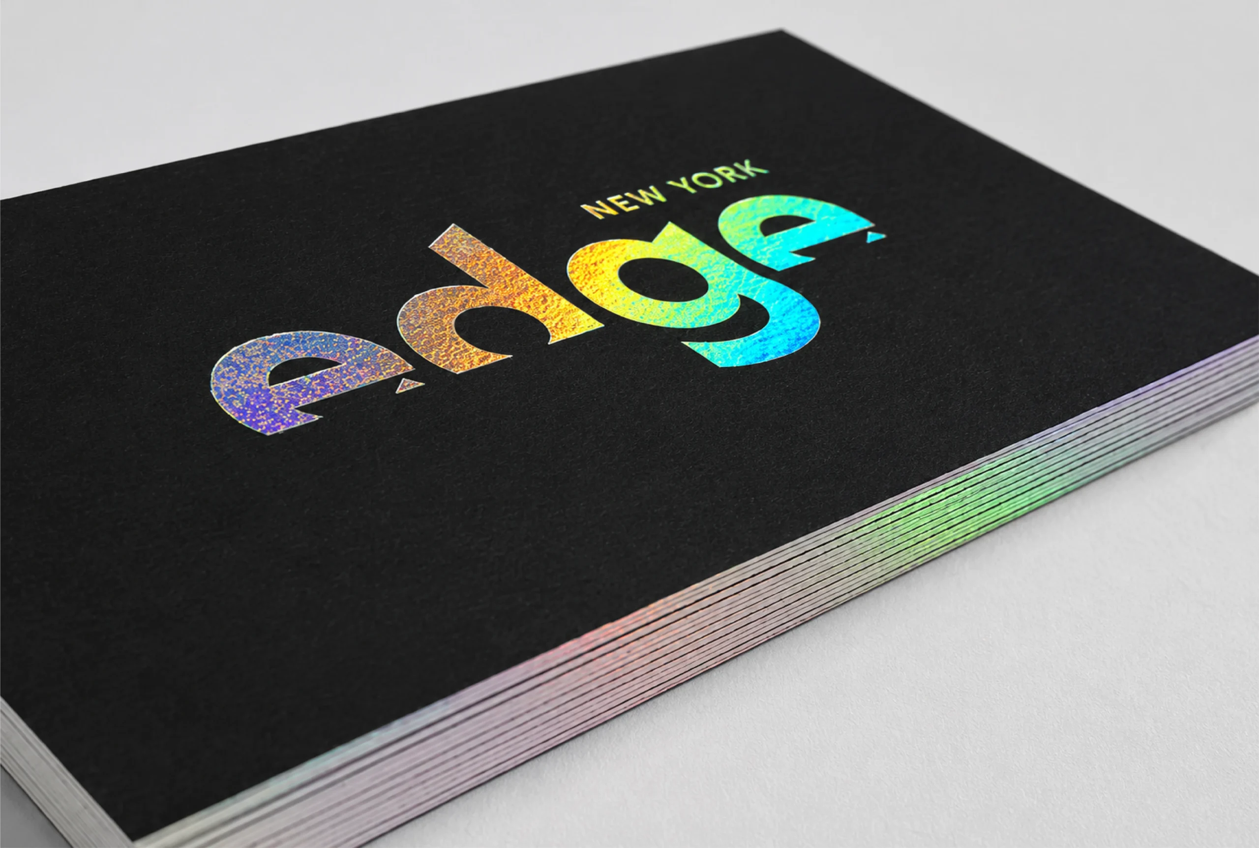
Holographic foil diffracts light and reveals the colors of the rainbow at various angles.
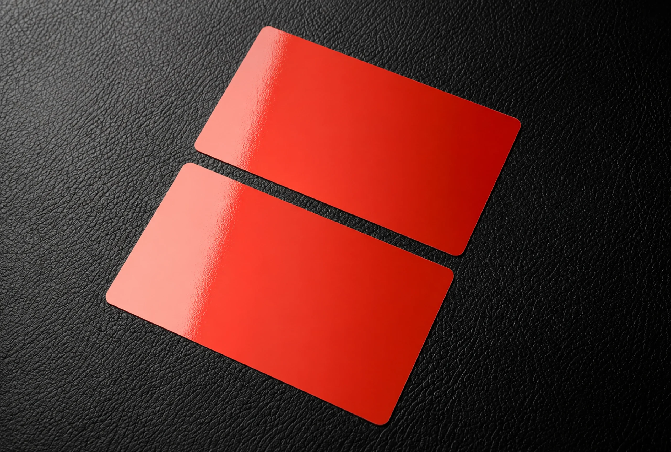
Our glossy finishing gives your packaging an extra layer of shine.
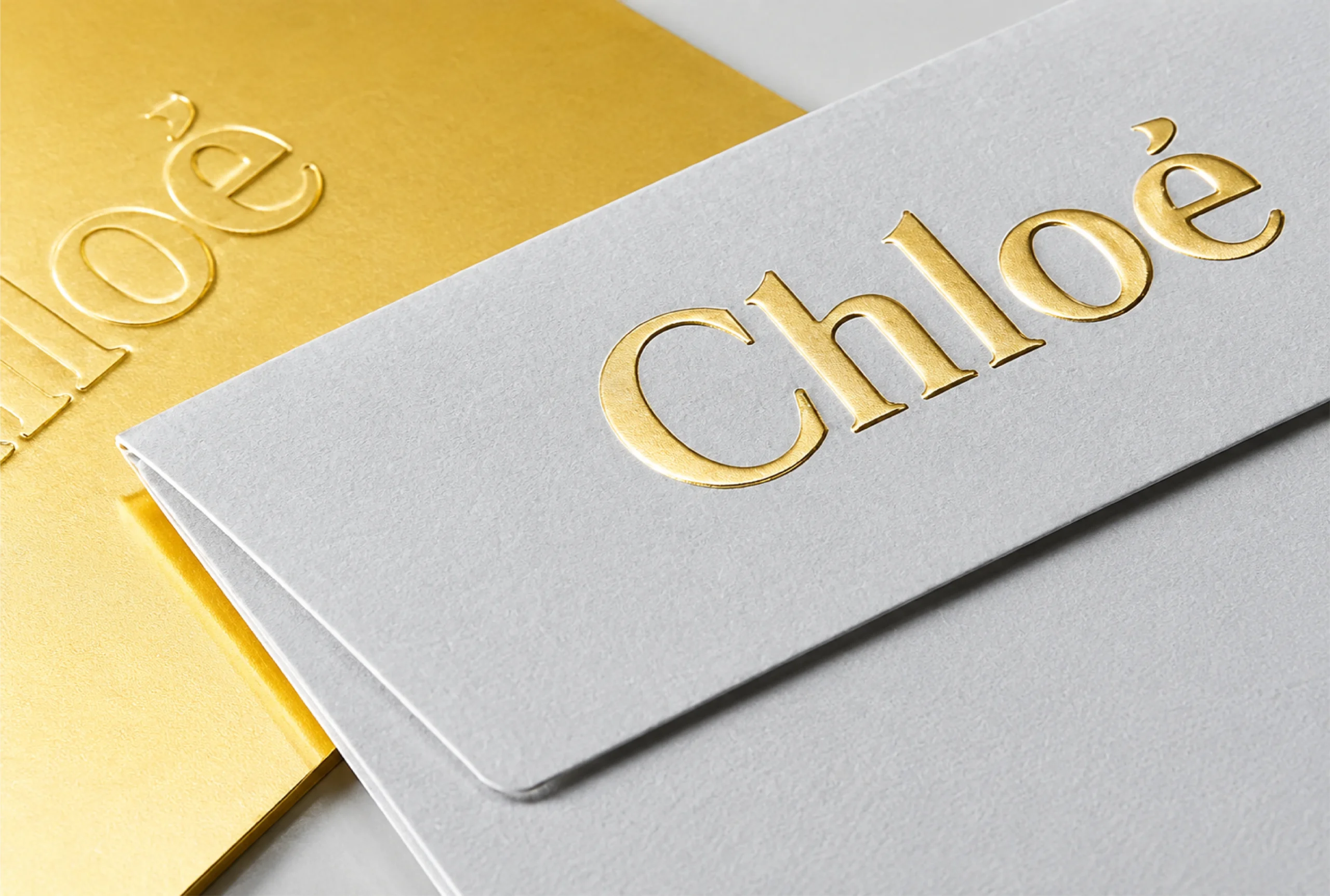
Decorate a wide range of your product packaging with our foil stamping.

With our embossing technique, we transfer the finest details of your product on packaging.
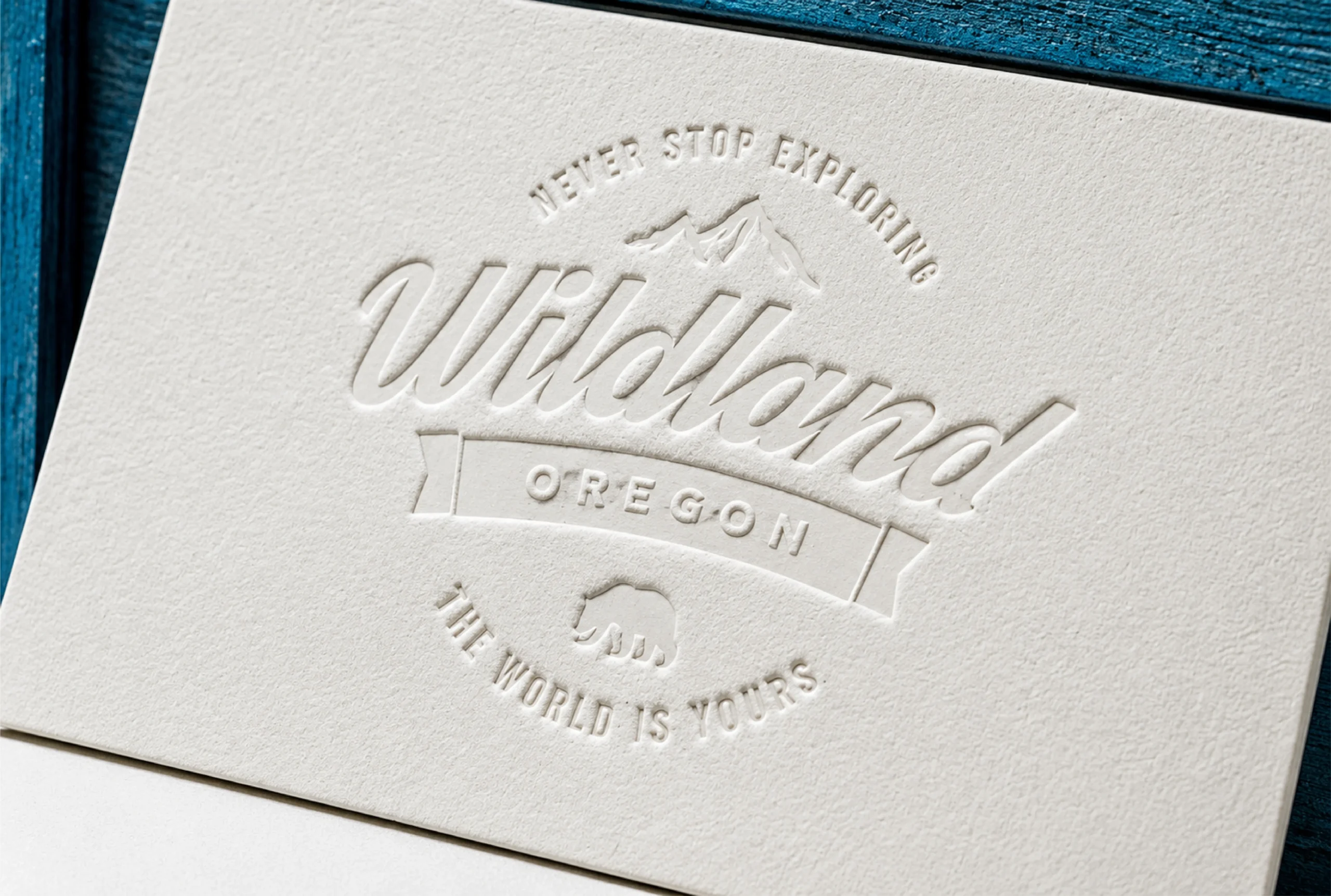
We use debossing technique to add unique graphics into your packaging.
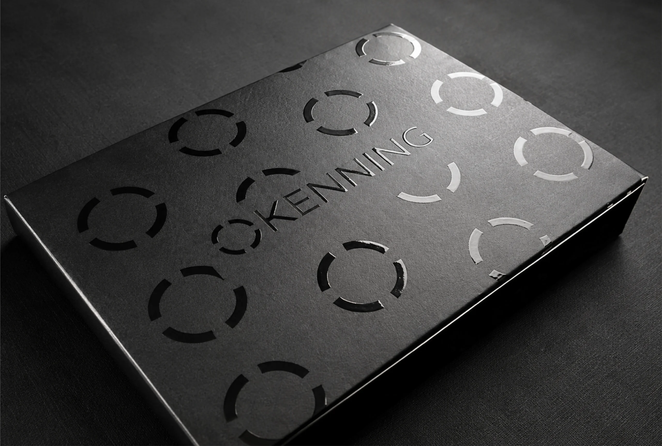
Our high-gloss UV coating gives light and shine to cure the printed material's varnish.
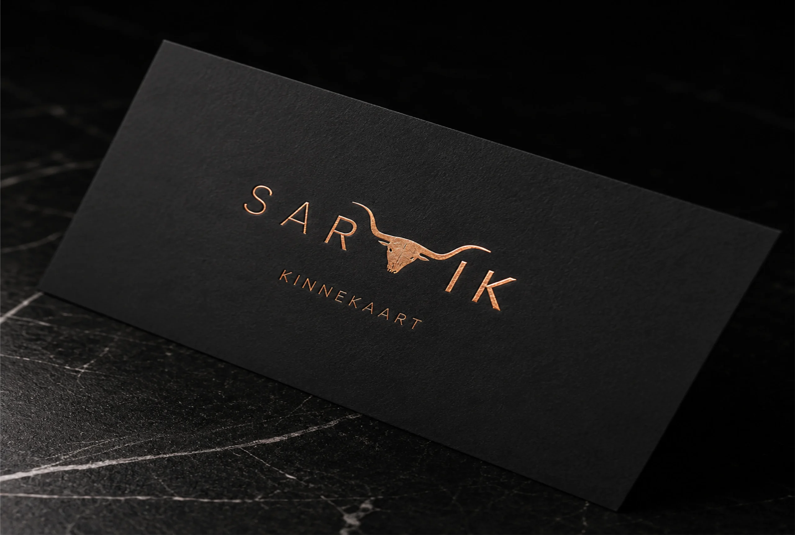
We add additional layer of protection with soft touch lamination from toner chipping.
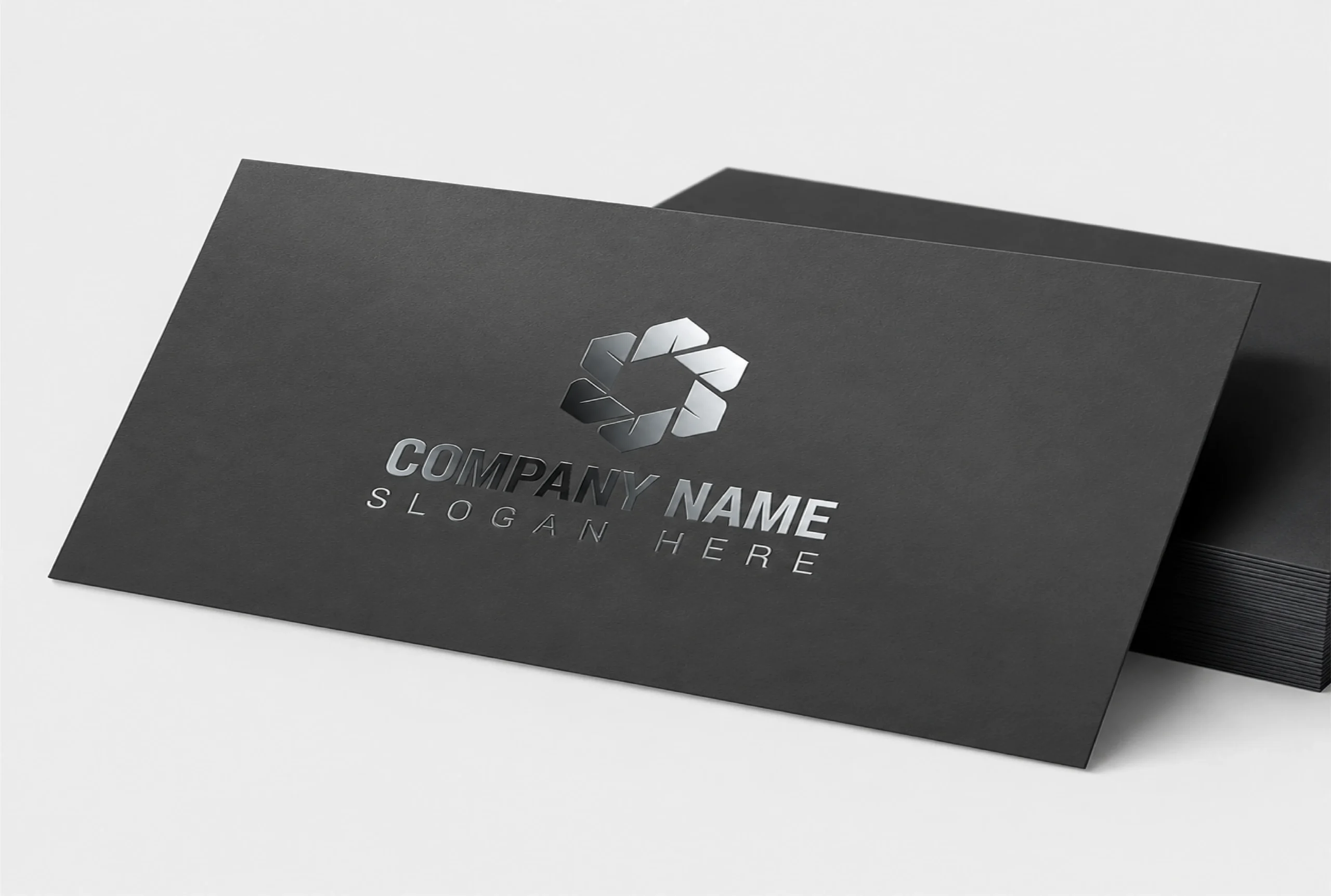
With our matte finish, fingerprints and smudges will now be less visible on the packaging.
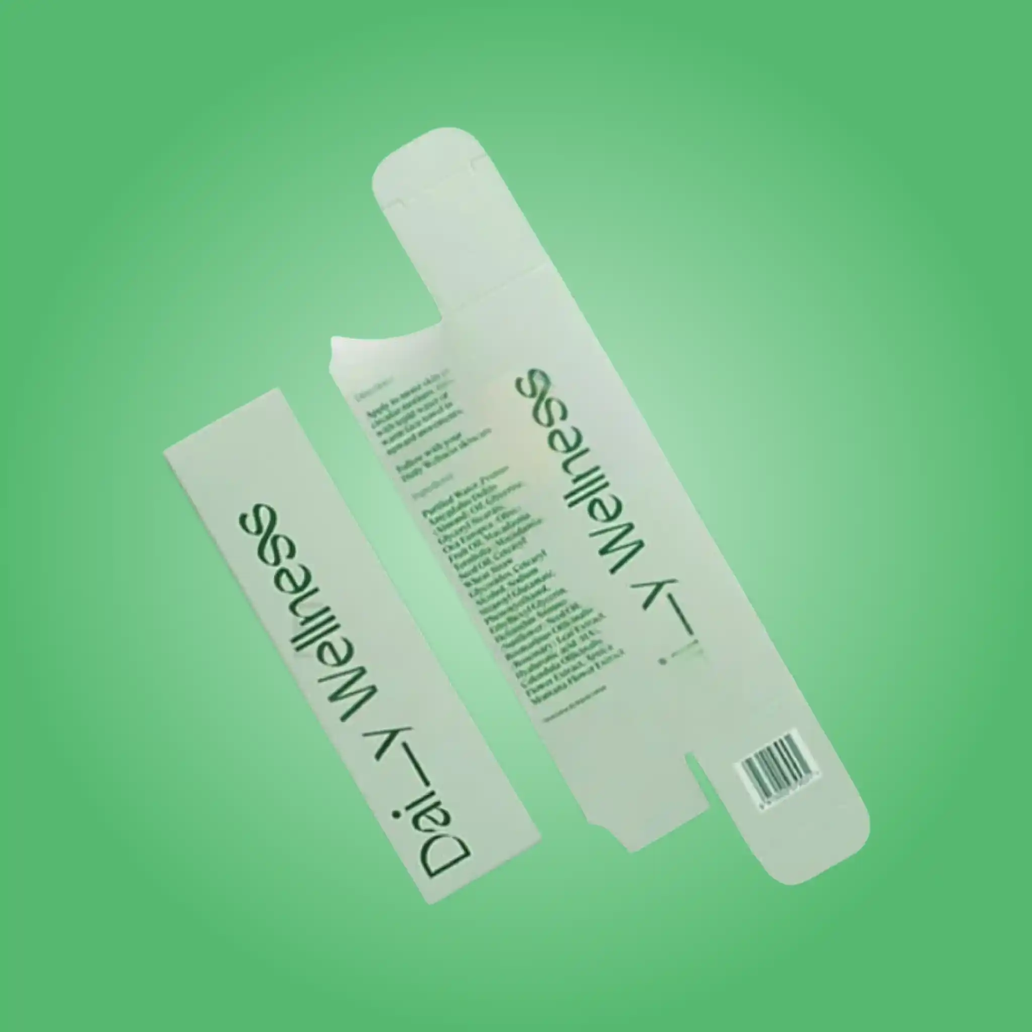
Custom straight tuck boxes from Pioneer Custom Boxes help cosmetic, skincare, supplement, candle, soap, food and ecommerce brands package products with a completely clean front panel. Choose SBS or kraft board from 14pt to 24pt, custom sizes, windows, inserts, foil, soft touch lamination, logo printing, free design support, no MOQ and free USA shipping.
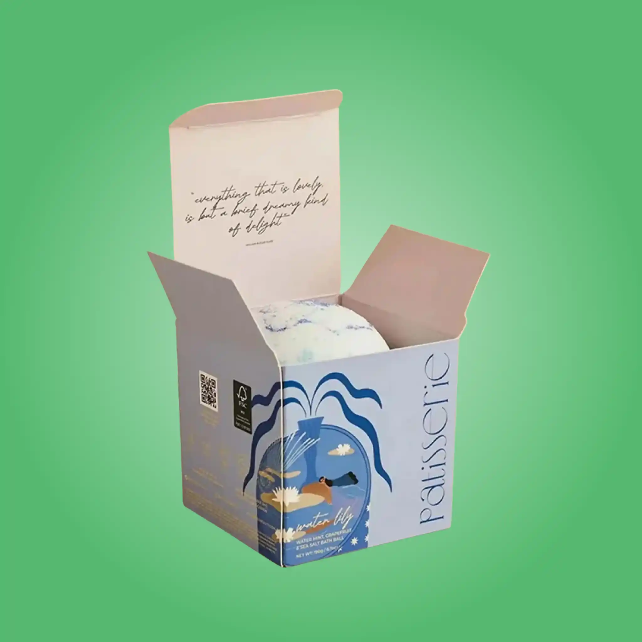
Custom tuck top boxes from Pioneer Custom Boxes help candle, home fragrance, food, bakery, hardware, gift and ecommerce brands package heavier products safely. Choose auto-lock or snap lock bases in SBS, kraft, CRB or E-flute board, with collar inserts, windows, foil, lamination, logo printing, free design support, no MOQ and free USA shipping.
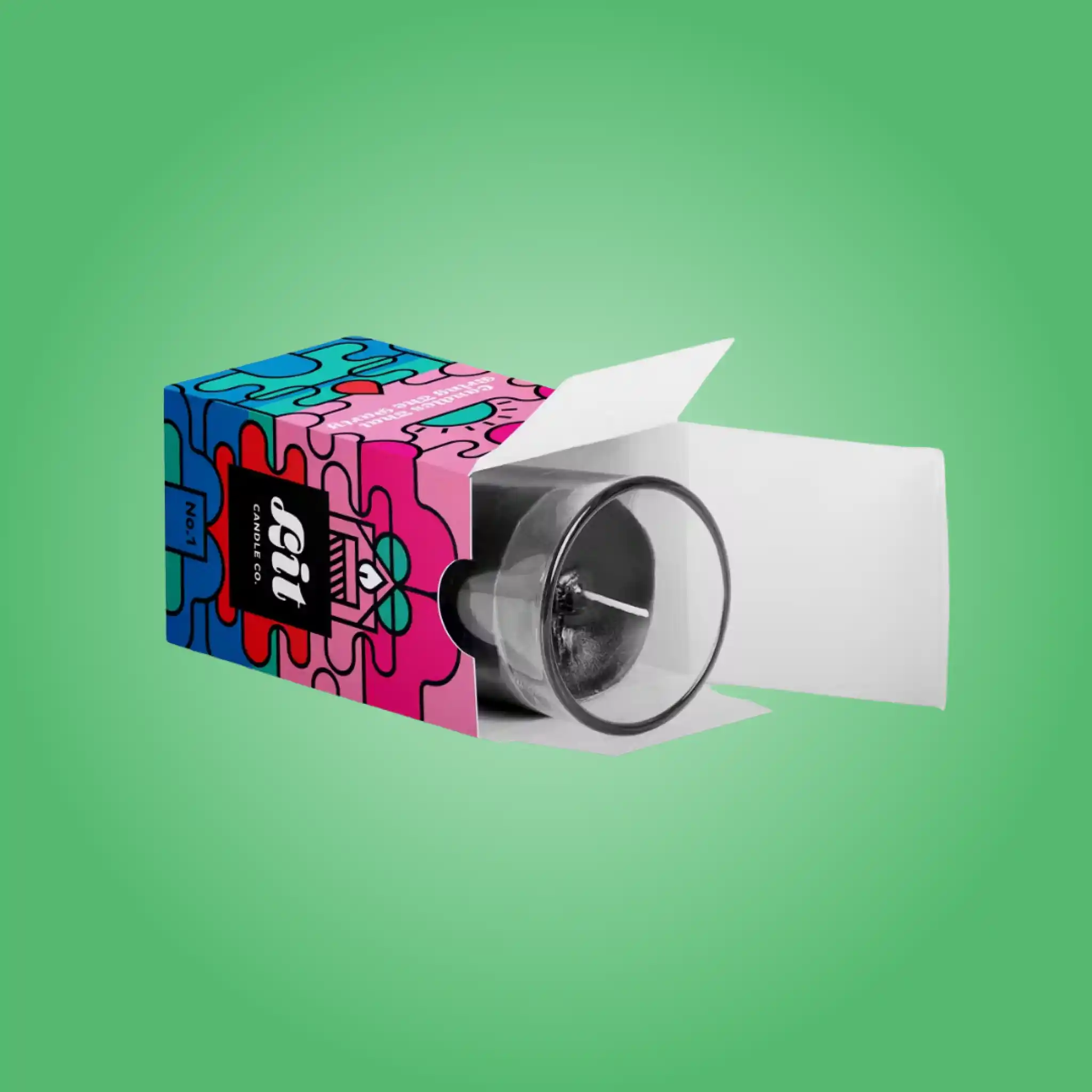
Reverse tuck candle boxes from Pioneer Custom Boxes help candle makers, home fragrance brands, gift companies and ecommerce sellers package filled glass vessels safely. Choose SBS, kraft, CRB or E-flute board from 18pt to 24pt, collar inserts, windows, foil stamping, soft touch lamination, logo printing, free design support, no MOQ and free USA shipping.
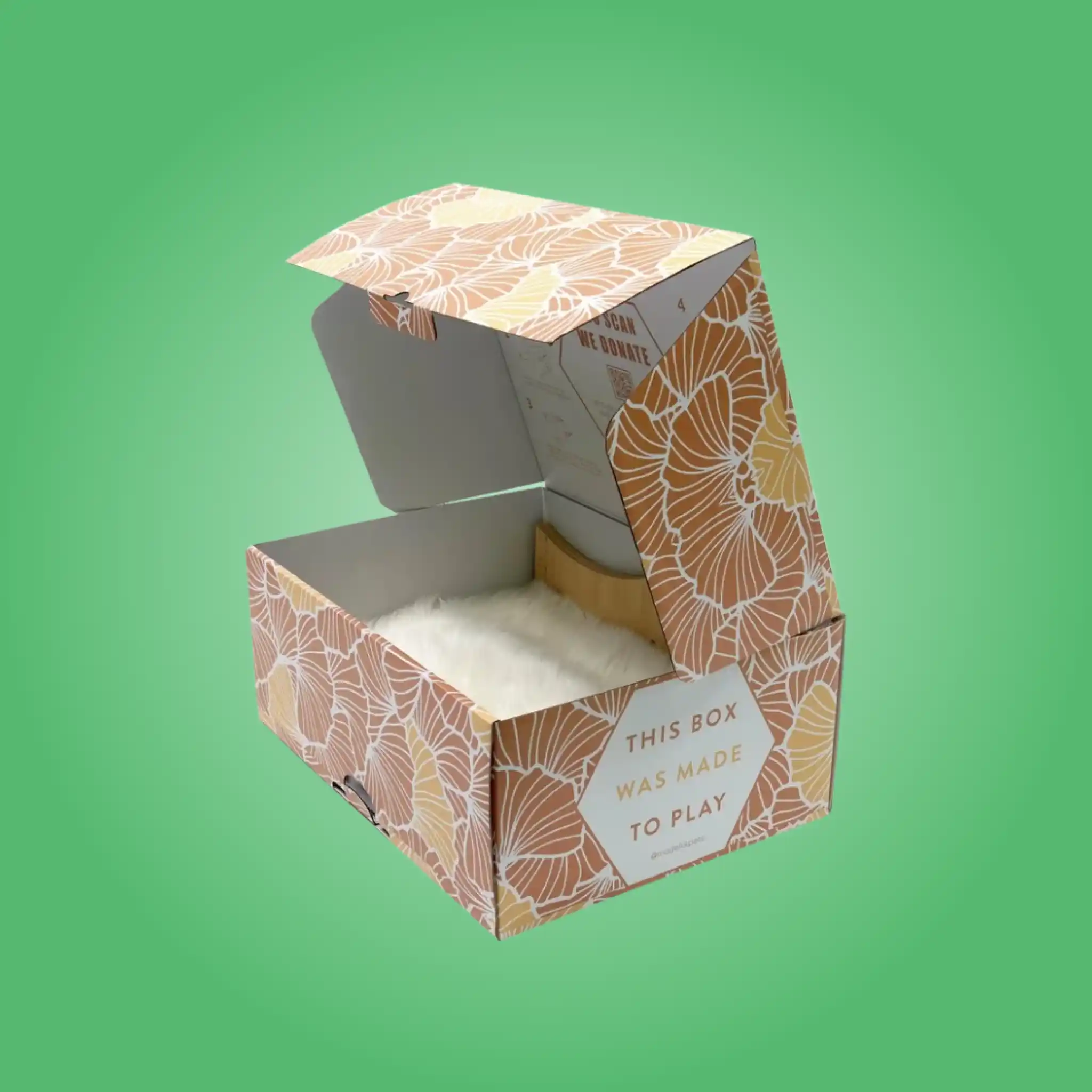
Tuck top mailer boxes from Pioneer Custom Boxes help beverage, candle, electronics, coffee, homeware, hardware and ecommerce brands ship heavier products without tape. Choose pre-glued auto-lock or snap lock bases in 32 to 51 ECT corrugated, white top or kraft liners, with collars, partitions, pulp cradles, printed interiors, free design support, no MOQ and free USA shipping.